Who doesn't like dancing? A dancing Sustainability Report is one that has great content and is presented so creatively that the content just dances right out at you. The online environment is your dance studio. Of course, you need fabulous dance instructors to turn your Sustainability Report in to a dancing report.
As a consultant and writer, my focus is primarily on the content of Sustainability Reports. Getting a balance of content and crafting the narrative is a thrilling part of the work. I love it. That's me, still a proud reporting geek. An important part of my work, however, is going beyond the content to engage with the graphic designers who put it into a form that is navigable, digestible and aesthetic and helps the report dance. This is no easy task. I am often mind-blown by the creative skill of the designers. Our interface is usually at the beginning and at the end when we are working with clients' in-house or external design teams:
As a consultant and writer, my focus is primarily on the content of Sustainability Reports. Getting a balance of content and crafting the narrative is a thrilling part of the work. I love it. That's me, still a proud reporting geek. An important part of my work, however, is going beyond the content to engage with the graphic designers who put it into a form that is navigable, digestible and aesthetic and helps the report dance. This is no easy task. I am often mind-blown by the creative skill of the designers. Our interface is usually at the beginning and at the end when we are working with clients' in-house or external design teams:
At the beginning: At the conceptual stage, once we have an idea about the focus of the report content and the key story for the reporting year, it's important to check in with the designers to make sure we are all aligned - and to help us prepare the content in a way that takes advantage of the possibilities and acknowledges the limitations of the selected report concept and format. Use of infographics, presentation of quotations, use of boxed text, dynamic presentation of charts and graphs...there are a million ways to do different things with words and numbers - it's important to set expectations up front and agree initial directions for key design elements early in the process.
At the end: Once 95% of the content is ready to go (it almost never gets to 100% at this stage), we shoot it to the designers. Then begins the long process of back and forth as we proof and reproof and check and recheck. Our role as overseers of the reports is critical at this stage. Aside from technical errors, which always happen (charts get inverted, dates get jumbled, pages get omitted, paragraphs are in the wrong order, letters are capitalized when they shouldn't be, all sorts of weird things happen in converting the content), designers do not always understand the nuances and critical context of the report content and therefore may select imagery that is totally inappropriate. We need to pick that up and oversee the integrity of the design in all of its different facets. This is often a challenge and, depending on the experience of the design team, can have us tearing or hair out - or gorging on triple chocolate fudge ice cream from early morning right through till late evening. And weekends.
The challenge is amplified when you are designing for the online environment. That's why I so appreciate and admire the work of my long-time friends Thomas Rosenmayr and the team at nexxar. They have a way of creating online reports (annual reports and sustainability reports - but I refer here mainly to the latter) that turn content into experience, text into narrative, numbers into pictures and a report into an event. nexxar's claim to fame is designing for online. They make reports dance. While PDFs remain an essential tool, especially for off-line use, nexxar has mastered and even championed the online environment for sustainability reporting.
Thomas says: "When we started our business we looked for a name that incorporates our aspiration to shape the future of corporate reporting. nexxar is an abbreviation for your next Annual Report. The .com domain attached to nexxar is a vital part of our company name. It stands for both our digital focus as well as our multinational business concept. Ever since we started, nexxar has devoted itself entirely to the topic of digital reporting. Since 2003 we have published more than 500 online reports, in our early days most of these reports were financial but nowadays half of the are Integrated or Sustainability Reports. Our mission is to develop digital reporting solutions that embrace technology for the benefit of its users as well as our clients. We believe the web is not just another communication channel to push content via PDF originally designed for printing. A good digital report does not just convert data but reshapes the messages to work non-linear as well as on screen and adds value through interactivity, multimedia and hyperlinking."
For a long time now I have been meaning to showcase some of nexxar's work here on the CSR Reporting Blog. The time has come. Here's a selection of some nexxar's report creations and how they dance.
Thomas says: "When we started our business we looked for a name that incorporates our aspiration to shape the future of corporate reporting. nexxar is an abbreviation for your next Annual Report. The .com domain attached to nexxar is a vital part of our company name. It stands for both our digital focus as well as our multinational business concept. Ever since we started, nexxar has devoted itself entirely to the topic of digital reporting. Since 2003 we have published more than 500 online reports, in our early days most of these reports were financial but nowadays half of the are Integrated or Sustainability Reports. Our mission is to develop digital reporting solutions that embrace technology for the benefit of its users as well as our clients. We believe the web is not just another communication channel to push content via PDF originally designed for printing. A good digital report does not just convert data but reshapes the messages to work non-linear as well as on screen and adds value through interactivity, multimedia and hyperlinking."
For a long time now I have been meaning to showcase some of nexxar's work here on the CSR Reporting Blog. The time has come. Here's a selection of some nexxar's report creations and how they dance.
Dancing Value Chain
Thomas says: "Using a clickable value chain is one of the best ways to get users right into the content of the report."
See this example from The Linde Group in its CR Report 2014.

In this report, online opens up with this overview of the value chain. Each element is clickable and takes you to the specific report content belonging to that click. For example, clicking on "25 million" (gas cylinders - the most commonly used form of packaging) takes you to a page on raw materials where you can find all relevant disclosures including clickable cross-references to GRI and UNGC indicators. The report is seamlessly navigable, with more about >> links for those who want more about, and side and top menus so that you never forget where you are.

From any page you can one-click to all Linde's key figures, cleanly laid out in table covering 5 years' performance

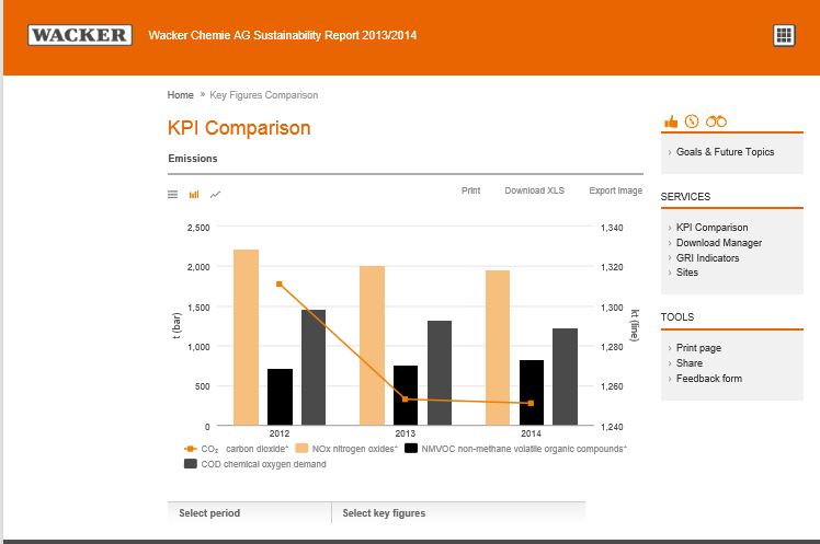
Dancing charts
Thomas says: "An interactive charting tool certainly is one dimension that digital can bring to the table to engage your audience. From what we can see in our statistics, this tool is very well received by web users."
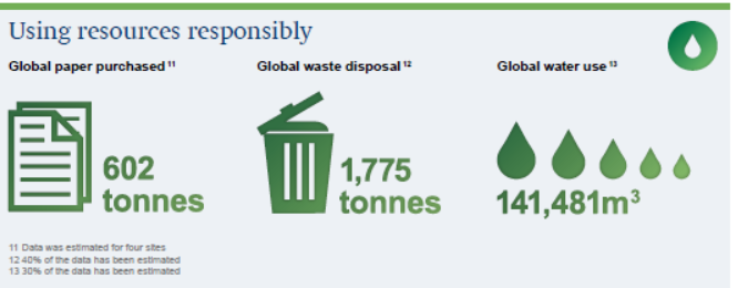
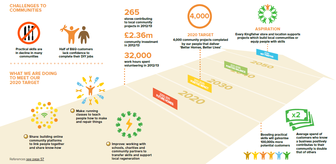
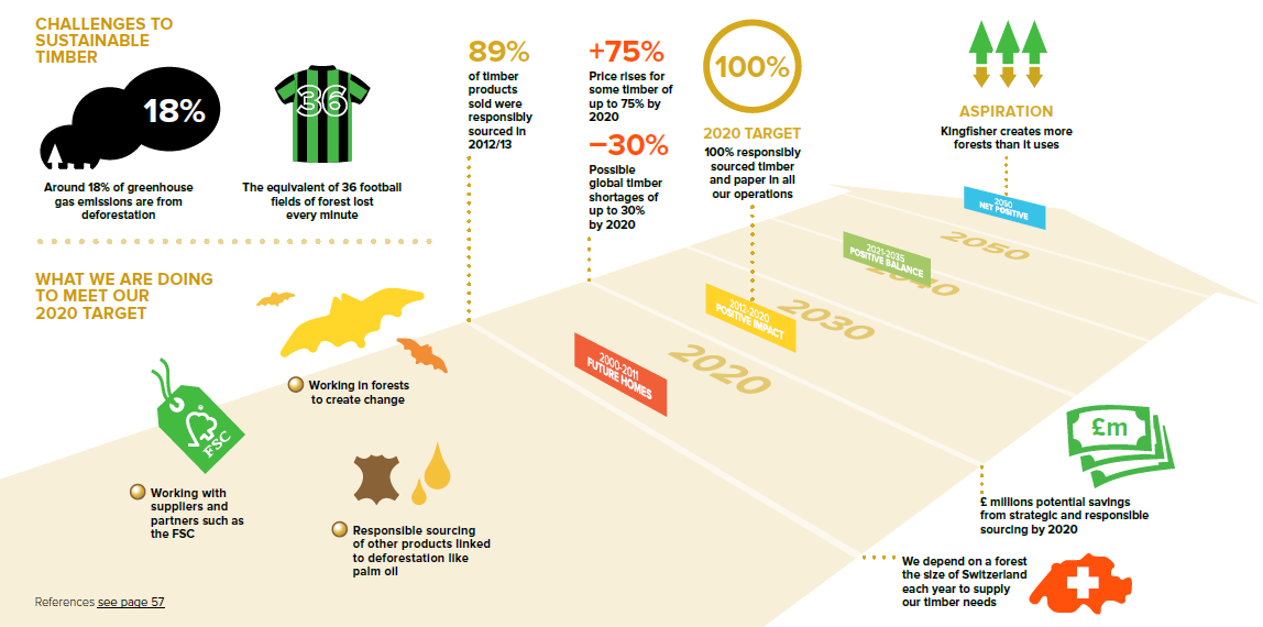
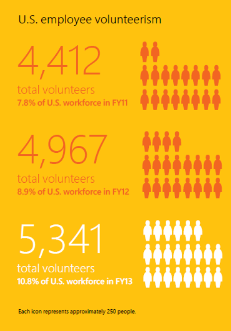
Dynamic responsive user-driven interactive charts and tables have become somewhat of a signature feature of nexxar's online creations. You can play around with numbers in charts, graphs and tables and totally enjoy the fun of seeing numbers miraculously appear in so many different ways. Such charts make the data so much more accessible. Here are a few examples:



Dancing Storytelling
Thomas says: "Engaging digital storytelling needs to be done different for the digital space "
See this example from Metro in its 2013-2014 Corporate Responsibility Report.

Metro Group's Report is clean and spacious and guides you to key content for heavy report users right from the report home page. The report has five main content sections called "spheres of action". The storytelling approach is done through short personal insights from key people in the Metro Group. Each shares a personal story about a sphere of action. The following section then details the company's progress and performance in this area.


Dancing materiality
Thomas says: "Interactive materiality index enables you to click on the legend to select / deselect issues. "
See this example from Legal and General in its 2014 Corporate Responsibility Report. L&G presents a rather full materiality matrix. To help the reader navigate this online, you can click on each of the dots and get a pop-up that tells you what it's all about.

In addition, there is a clickable list of material impacts that take you directly to the relevant content.

And the home page of the report has clickable drop-down menus that take you to any part of the report at the click of a click.

Dancing home page
Thomas says: "The home page of the online Sustainability Report should guide readers to interesting content. "
See this example from SNAM's 2014 Sustainability Report

Another nice online feature of SNAM's report is the download center where you can download all or bits of the report and/or go straight to the hyperlinked GRI content index. Navigation at its best.

Dancing gallery
See this example from Merck Group's 2014 Corporate Responsibility Report

This photo gallery is a great way to attract the reader to the relevant stories in the report. When you click on a black and white image, it suddenly goes technicolor and the screen below jumps to the story narrative.
Dancing GRI Content Index
Thomas says: "Interactive GRI Index actually is the perfect fit for the web, sometimes I think GRI invented this index for online usage. While in a print based document the indicators are referenced by page numbers, within the web version these are converted to hyperlinks leading you on-click to the right spot not just within the Sustainability Report but also to the Annual Report or any other website providing the necessary information."
See these examples:


(this is a UNGC index against the 10 principles)

The concertina GRI Content Index that expands and contracts to let you decide how much content you want to see, with content hyperlinked to the report sections, really makes navigating to selected content a pleasure.
I couldn't let Thomas off the hook without asking him a few more questions about nexxar and online Sustainability Reporting.
When you co-founded nexxar in 2003, sustainability reporting was just getting started. Also, the online environment was hardly as expansive as it is today. 12 years on, did you expect that you would become a champion of online sustainability reporting? How did you make that happen?
Thomas says: "I think what you end up with on a long-term scale is never fully congruent with your original plans. When we started business, I wasn't so much aware of Sustainability Reports. But wanted to have an impact on corporate reporting. As our service is quite specific, right from the beginning, our clients have been large multinational corporations who forced us to fully focus on quality and innovation. The early days of the Internet opened up this great opportunity for nexxar as a tiny start up offering a service that large corporations could not fulfil internally. Defining clear goals with our clients right from the beginning is key for our long-term success. And over time lot of companies understood that the web is the perfect communication channel for sustainability matters. Main advantages are the global reach combined with a very efficient use of resources as well as the two-way communication to truly engage with their audience."
What do you find most challenging in designing Sustainability Reports for online reading?
Thomas says: "The dominant mindset still thinks in pages. Almost all content is created on paper based software like Word. Not only text but also images, graphs, diagrams or even tables are designed to fit on portrait format. To convert this content later on for a screen based viewport will always have its limitations. How can you transform a business diagram or management picture to change from portrait to landscape format? Other issues include contrasts of images, fonts or content structure. Sometimes it's impossible to generate a usable navigation for multi-page textual wasteland. Online we need a clear hierarchy as well as teaser content on main pages providing users a clear understanding where to continue their journey. In our lab we present some of the most important do's and don'ts when editing contents for the web "
And what do you find most satisfying?
Thomas says: "Sustainability Reports do not have regulatory restrictions like financial reports. They are more flexible when it comes to designing content for digital. When involved right from the beginning there is a lot of positive impact that is possible for the digital report. Also people involved in sustainability are way more more web savvy. The web is perceived as a chance for sustainability not as a threat against traditional communications. As a result, we see adoption to web techniques like using a CMS to compose content easier (see more information on our online first approach) .
When you start work on a new sustainability report for the online environment, what are the three non-negotiables you present to your client?
Thomas says: "That's a difficult question. We see ourselves as providers of a high level service. There are some high level no-go's for us. For example, we do not white label our work through other agencies. We see the direct contact to our clients being essential for the quality of our reports as well as for our own satisfaction. We live for what we do. On the other hand, our clients have their own views or needs and we fully respect this. Three things we see as indisputable for a usable online sustainability report would certainly include:
- Web based navigation that provides individual structure with sublevels
- All content needs to be presented in HTML to be fully accessible
- Responsive design, so the layout adopts flexible to the screen width of the device used."
Rounding off, I love the work that nexxar does to make sustainability disclosure more accessible. If you haven't selected your providers for your first or your next Sustainability Report, using expert providers such as nexxar for design and Beyond Business (ahem, couldn't resist) for content is a sure way to make your report dance.
elaine cohen, CSR consultant, Sustainability Reporter, HR Professional, Ice Cream Addict. Author of Understanding G4: the Concise Guide to Next Generation Sustainability Reporting AND Sustainability Reporting for SMEs: Competitive Advantage Through Transparency AND CSR for HR: A necessary partnership for advancing responsible business practices . Contact me via Twitter (@elainecohen) or via my business website www.b-yond.biz (Beyond Business Ltd, an inspired CSR consulting and Sustainability Reporting firm). Need help writing your first / next Sustainability Report? Contact elaine: info@b-yond.biz






















 Posts
Posts

