Showing posts with label online. Show all posts

Monday, November 30, 2015

7 tools to make your online Sustainability Report dance

Who doesn't like dancing? A dancing Sustainability Report is one that has great content and is presented so creatively that the content just dances right out at you. The online environment is your dance studio. Of course, you need fabulous dance instructors to turn your Sustainability Report in to a dancing report.

As a consultant and writer, my focus is primarily on the content of Sustainability Reports. Getting a balance of content and crafting the narrative is a thrilling part of the work. I love it. That's me, still a proud reporting geek. An important part of my work, however, is going beyond the content to engage with the graphic designers who put it into a form that is navigable, digestible and aesthetic and helps the report dance. This is no easy task. I am often mind-blown by the creative skill of the designers. Our interface is usually at the beginning and at the end when we are working with clients' in-house or external design teams:

At the beginning: At the conceptual stage, once we have an idea about the focus of the report content and the key story for the reporting year, it's important to check in with the designers to make sure we are all aligned - and to help us prepare the content in a way that takes advantage of the possibilities and acknowledges the limitations of the selected report concept and format. Use of infographics, presentation of quotations, use of boxed text, dynamic presentation of charts and graphs...there are a million ways to do different things with words and numbers - it's important to set expectations up front and agree initial directions for key design elements early in the process. 

At the end: Once 95% of the content is ready to go (it almost never gets to 100% at this stage), we shoot it to the designers. Then begins the long process of back and forth as we proof and reproof and check and recheck. Our role as overseers of the reports is critical at this stage. Aside from technical errors, which always happen (charts get inverted, dates get jumbled, pages get omitted, paragraphs are in the wrong order, letters are capitalized when they shouldn't be, all sorts of weird things happen in converting the content), designers do not always understand the nuances and critical context of the report content and therefore may select imagery that is totally inappropriate. We need to pick that up and oversee the integrity of the design in all of its different facets. This is often a challenge and, depending on the experience of the design team, can have us tearing or hair out - or gorging on triple chocolate fudge ice cream from early morning right through till late evening. And weekends.

The challenge is amplified when you are designing for the online environment. That's why I so appreciate and admire the work of my long-time friends Thomas Rosenmayr and the team at nexxar. They have a way of creating online reports (annual reports and sustainability reports - but I refer here mainly to the latter) that turn content into experience, text into narrative, numbers into pictures and a report into an event. nexxar's claim to fame is designing for online. They make reports dance. While PDFs remain an essential tool, especially for off-line use, nexxar has mastered and even championed the online environment for sustainability reporting.

Thomas says: "When we started our business we looked for a name that incorporates our aspiration to shape the future of corporate reporting. nexxar is an abbreviation for your next Annual Report. The .com domain attached to nexxar is a vital part of our company name. It stands for both our digital focus as well as our multinational business concept. Ever since we started, nexxar has devoted itself entirely to the topic of digital reporting. Since 2003 we have published more than 500 online reports, in our early days most of these reports were financial but nowadays half of the are Integrated or Sustainability Reports. Our mission is to develop digital reporting solutions that embrace technology for the benefit of its users as well as our clients. We believe the web is not just another communication channel to push content via PDF originally designed for printing. A good digital report does not just convert data but reshapes the messages to work non-linear as well as on screen and adds value through interactivity, multimedia and hyperlinking."

For a long time now I have been meaning to showcase some of nexxar's work here on the CSR Reporting Blog. The time has come. Here's a selection of some nexxar's report creations and how they dance. 

Dancing Value Chain

Thomas says: "Using a clickable value chain is one of the best ways to get users right into the content of the report."

See this example from The Linde Group in its CR Report 2014.

In this report, online opens up with this overview of the value chain. Each element is clickable and takes you to the specific report content belonging to that click. For example, clicking on "25 million" (gas cylinders - the most commonly used form of packaging) takes you to a page on raw materials where you can find all relevant disclosures including clickable cross-references to GRI and UNGC indicators. The report is seamlessly navigable, with more about >> links for those who want more about, and side and top menus so that you never forget where you are. 


From any page you can one-click to all Linde's key figures, cleanly laid out in table covering 5 years' performance


Dancing charts

Thomas says: "An interactive charting tool certainly is one dimension that digital can bring to the table to engage your audience. From what we can see in our statistics, this tool is very well received by web users."

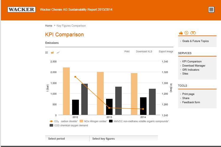
Dynamic responsive user-driven interactive charts and tables have become somewhat of a signature feature of  nexxar's online creations. You can play around with numbers in charts, graphs and tables and totally enjoy the fun of seeing numbers miraculously appear in so many different ways. Such charts make the data so much more accessible.  Here are a few examples:


Dancing Storytelling

Thomas says: "Engaging digital storytelling needs to be done different for the digital space "

See this example from Metro in its 2013-2014 Corporate Responsibility Report.


Metro Group's Report is clean and spacious and guides you to key content for heavy report users right from the report home page. The report has five main content sections called "spheres of action". The storytelling approach is done through short personal insights from key people in the Metro Group. Each shares a personal story about a sphere of action. The following section then details the company's progress and performance in this area. 


Dancing materiality

Thomas says: "Interactive materiality index enables you to click on the legend  to select / deselect issues. "

See this example from Legal and General in its 2014 Corporate Responsibility Report. L&G presents a rather full materiality matrix. To help the reader navigate this online, you can click on each of the dots and get a pop-up that tells you what it's all about.


In addition, there is a clickable list of material impacts that take you directly to the relevant content.


And the home page of the report has clickable drop-down menus that take you to any part of the report at the click of a click.


Dancing home page

Thomas says: "The home page of the online Sustainability Report should guide readers to interesting content. "

See this example from SNAM's 2014 Sustainability Report


Another nice online feature of SNAM's report is the download center where you can download all or bits of the report and/or go straight to the hyperlinked GRI content index. Navigation at its best.


Dancing gallery

Thomas says: "Photo galleries are a great way to draw attention to great stories."

See this example from  Merck Group's 2014 Corporate Responsibility Report

This photo gallery is a great way to attract the reader to the relevant stories in the report. When you click on a black and white image, it suddenly goes technicolor and the screen below jumps to the story narrative. 

Dancing GRI Content Index

Thomas says: "Interactive GRI Index actually is the perfect fit for the web, sometimes I think GRI invented this index for online usage. While in a print based document the indicators are referenced by page numbers, within the web version these are converted to hyperlinks leading you on-click to the right spot not just within the Sustainability Report but also to the Annual Report or any other website providing the necessary information."

See these examples:


(this is a UNGC index against the 10 principles)

The concertina GRI Content Index that expands and contracts to let you decide how much content you want to see, with content hyperlinked to the report sections, really makes navigating to selected content a pleasure. 


I couldn't let Thomas off the hook without asking him a few more questions about nexxar and online Sustainability Reporting.

When you co-founded nexxar in 2003, sustainability reporting was just getting started. Also, the online environment was hardly as expansive as it is today. 12 years on, did you expect that you would become a champion of online sustainability reporting? How did you make that happen? 
Thomas says: "I think what you end up with on a long-term scale is never fully congruent with your original plans. When we started business, I wasn't so much aware of Sustainability Reports. But wanted to have an impact on corporate reporting. As our service is quite specific, right from the beginning, our clients have been large multinational corporations who forced us to fully focus on quality and innovation. The early days of the Internet opened up this great opportunity for nexxar as a tiny start up offering a service that large corporations could not fulfil internally. Defining clear goals with our clients right from the beginning is key for our long-term success. And over time lot of companies understood that the web is the perfect communication channel for sustainability matters. Main advantages are the global reach combined with a very efficient use of resources as well as the two-way communication to truly engage with their audience." 

What do you find most challenging in designing Sustainability Reports for online reading? 
Thomas says: "The dominant mindset still thinks in pages. Almost all content is created on paper based software like Word. Not only text but also images, graphs, diagrams or even tables are designed to fit on portrait format. To convert this content later on for a screen based viewport will always have its limitations. How can you transform a business diagram or management picture to change from portrait to landscape format? Other issues include contrasts of images, fonts or content structure. Sometimes it's impossible to generate a usable navigation for multi-page textual wasteland. Online we need a clear hierarchy as well as teaser content on main pages providing users a clear understanding where to continue their journey. In our lab we present some of the most important do's and don'ts when editing contents for the web "  

And what do you find most satisfying? 
Thomas says: "Sustainability Reports do not have regulatory restrictions like financial reports. They are more flexible when it comes to designing content for digital. When involved right from the beginning there is a lot of positive impact that is possible for the digital report. Also people involved in sustainability are way more more web savvy. The web is perceived as a chance for sustainability not as a threat against traditional communications. As a result, we see adoption to web techniques like using a CMS to compose content easier (see more information on our online first approach) .  

When you start work on a new sustainability report for the online environment, what are the three non-negotiables you present to your client? 
Thomas says: "That's a difficult question. We see ourselves as providers of a high level service. There are some high level no-go's for us. For example, we do not white label our work through other agencies. We see the direct contact to our clients being essential for the quality of our reports as well as for our own satisfaction. We live for what we do. On the other hand, our clients have their own views or needs and we fully respect this. Three things we see as indisputable for a usable online sustainability report would certainly include: 
  • Web based navigation that provides individual structure with sublevels 
  • All content needs to be presented in HTML to be fully accessible 
  • Responsive design, so the layout adopts flexible to the screen width of the device used."


Rounding off, I love the work that nexxar does to make sustainability disclosure more accessible. If you haven't selected your providers for your first or your next Sustainability Report, using expert providers such as nexxar for design and Beyond Business (ahem, couldn't resist) for content is a sure way to make your report dance.  


elaine cohen, CSR consultant, Sustainability Reporter, HR Professional, Ice Cream Addict. Author of Understanding G4: the Concise Guide to Next Generation Sustainability Reporting  AND  Sustainability Reporting for SMEs: Competitive Advantage Through Transparency AND CSR for HR: A necessary partnership for advancing responsible business practices . Contact me via Twitter (@elainecohen)  or via my business website www.b-yond.biz   (Beyond Business Ltd, an inspired CSR consulting and Sustainability Reporting firm).  Need help writing your first / next Sustainability Report? Contact elaine: info@b-yond.biz  

Sunday, October 19, 2014

Frustrations with online reporting

As techy as I am, and I am reasonably digitally-literate, I suppose, for my age (as my kids would say about anyone over 35), there is something about online reports that doesn't work for me. 

It's fabulous to have information accessible but for me, a report that is entirely online with no possibility to download the full or at least a summary is a turn-off. I was travelling last week in Europe and internet access is not always easy. Free WiFi in my hotel gave such a weak signal that I abandoned it. In other places, international roaming costs an arm and a leg. I have a personal hotspot deal that provides 400MB for around $10 and that's pretty good, but for a heavy user such as me (not games or movies, just regular work type surfing, downloading reports (:)), emailing and a few apps), that barely covers half a day. Local or international data bundles are not always available and when they are, the price per mega is far more. Travelling is the one time that I have time to look at things I don't have time to look at when I am under deadline pressures. Flying time is perfect - oops, no internet on flights. I have about another 50 hours of flying and airport time coming up in November - most of that is free-WiFi-less. No online reports. I have no idea what free or low-cost internet access is like in other parts of the world outside of Europe and the U.S. and a few other places I have traveled. I expect it's even harder or costlier to hook up outside your own home in many places. So, why do companies insist on providing sustainability reports that can only be viewed online? This is so restrictive. Financial reports are never only online (I believe) - there is always a downloadable document. 

Don't get me wrong, online is great and opens up access to many - including consumers - that reports wouldn't otherwise reach. Online reports provide opportunities for feedback and dialogue in real-time - page by page - much better than asking someone to provide feedback about an entire report if they have read only a couple of sections. Sharability of online content is also a big advantage for expanding the reach of your report. But can't we have the best of both worlds? 


The report is a long down-scroll webpage with highlights. Side-scrolling from each section takes you to more detail.


But, when you go for the detail, you lose the report.

For example, I selected to "learn more" about sustainability education for employees. I left-scrolled. This brought me to another page with a font so small I had to enlarge my screen.


After the short text, there is a clickable link to a "Related Article" which brings you to another part of the Annie's website that is outside of the report content. Browser back-click to get back to the report. Repeat endless times to actually read any content. Don't bother. Simply give up. 

No site-map, no contents list, no index. For some, this may be a great online experience. For myself, a professionally-oriented reader of reports (and I understand that I might be outside Annie's target audience, even though I am positively disposed towards organic food :)), it really doesn't work for me and I give up once I see that I am getting nowhere fast. While I commend this organization, and I really do, for reporting on sustainability and doing so quite attractively and creatively, as well as achieving some sustainability performance plusses, I find this reporting format frustrating. (At least it's not a flip-book. Don't get me started on those.....). A small PDF download for me to read offline in an orderly and sequential way would make all the difference.  

Annie's is just one example of many companies that seem to believe that the progressive and PC thing today is to report exclusively online. I could give many more report examples, some that have easier navigation, some that are impossible, some long, some short, some with webby pyrotechnics and pop-ups and pop-outs and dynamic menus and charts and more. No matter how fancy they are, I can never read them on a flight, it costs me an arm and a leg to read them while I am travelling, and I have to spend (and waste) time clicking away for everything I want to glance at. 

The real value of online reports should be real-time accessibility and interactability. Accessibility is limited, as I have noted, but if your report is online, then why not use this as an opportunity to invite feedback online and generate some dialogue? A bit of talkback may do the company some good. A learning opportunity. The Annie's report interactivity is one-way. It has several share buttons - you can pinterest it, google it, facebook it and even email the URL to all your closest friends.... but you can't comment on it. You could go to Twitter and interact with @AnniesCEO there, but who can be bothered? Twitter is not the best tool for providing report feedback. 

This rant-post therefore is both an expression of my frustration to all online-only reporters and a plea to you/them to go the extra mile and publish reports in a way that make it easier for a wider range of stakeholders to use them. I LOVE reports. I hate having to miss out because online just isn't there yet. 

PS: Maybe we have missed the boat with Annie's. The company has now been bought by General Mills. At least General Mills has a downloadable PDF sustainability report. However, I am not so optimistic about the chances of Annie's brands competing strongly with Cheerios for page space so we might just find ourselves wanting the online report back :-)


elaine cohen, CSR consultant, Sustainability Reporter, HR Professional, Ice Cream Addict. Author of Understanding G4: the Concise guide to Next Generation Sustainability Reporting  AND  Sustainability Reporting for SMEs: Competitive Advantage Through Transparency AND CSR for HR: A necessary partnership for advancing responsible business practices . Contact me via Twitter (@elainecohen)  or via my business website www.b-yond.biz   (Beyond Business Ltd, an inspired CSR consulting and Sustainability Reporting firm).  Check out our G4 Report Expert Analysis Service - for published G4 reports or pre-publication - write to Elaine at info@b-yond.biz to help make your G4 reporting  even better.   

Friday, May 30, 2014

Digitizing materiality


This week was a fun week! Amidst all the intensely intensive intensity of G4 reporting for several months as clients race to meet reporting deadlines and us with them, I was able to take a couple of serene days to spend time with fabulous people, enjoy fabulous food in a fabulous setting, and hear some fabulously new stuff.
 
Yes, I was at the Lundquist 6th annual CSR Awards conference and event in Milan, a gathering of specialist communications and CSR experts from all over Europe. Lundquist is a strategic communications consulting firm based in Italy, and the company boasts a team of leading thinkers in the digital corporate communications space. The recently published Lundquist survey results with trends and practices around CSR and the online universe can be downloaded here:
 
 
The research shows an acceleration of the uptake of social and digital technologies compared with previous editions of the research. Now, virtually all sustainability professionals (94%) are on social media with three quarters of these doing so in relation to CSR and sustainability. Video and infographic content are gaining popularity and CSR Managers have become the new social media stars, with everyone wanting to hear from them online. It's always fun to know what frustrates people and the Lundquist research confirmed what we already know - that too much good news is not good news.


The full results and the details of the CSR award winners can be downloaded here. Deutsche Post DHL took first prize, with Nestle and Unilever close behind.
 
 
In the Lundquist home market, Italy, Telecom Italia, Hera Group and Snam took the trophies.

Lundquist's research and analysis is really quite fascinating and contains much that should be of interest to CSR corporate communicators. Well worth studying!

During the two day conference, I was pleased to facilitate a workshop with presenters and panelists from Hera Group, Birra Peroni (SAB Miller) and Adidas. I opened up (my presentation embedded below) with an overview of opportunities and risks in the digitization of materiality and stakeholder engagement. While there is incredible potential to reach to stakeholders using online tools, there are also dangers arising from inappropriate use. Not everything that is online provides real insight that is relevant enough to deliver a robust materiality conclusion. The fact that Survey Monkey is free and there is a (G4) stakeholder engagement materiality box to tick does not mean that stakeholder engagement happens. As an element in a set of digital and non-digital tools, there is a place for online surveys. But let's not dumb down stakeholder engagement to the point of mindlessness by going through the motions without due planning and focus.


One of the questions that generated the most debate in our workshop was how to find the right balance between, on the one hand, targeted engagement of experts that can make a contribution based on knowledge, experience and critical analysis and, on the other hand, reach to the general mass consumer population that is, after all, the group that decides whether to buy a company's product or not. We shared lots of views and recognized that each company needs to assess what tools will deliver the most useful materiality input and most reflect stakeholder views in a representative way. Not all stakeholders are equal but no single algorithm can determine which are the most equal.

All in all, a stimulating couple of days, professionally and skillfully organized by the Lundquist team.


My photo gallery from the CSR Awards conference and event
a fabulous colorful place to stay - Hotel Mediolanum

Kicking things off with digital disruption

Joakim Lundquist who kept the two days moving at a pace

Are sustainability reports really dinosaurs? 

The Gala Dinner - in anticipation

The Gala Dinner - home straits

Gotta keep talking

James Osborne, the CSR social media stats and trends wizard
hate turgid

David Connor @davidcoethica raring to present on the ways of using social media
Christine Hermann of Orange talks about what's important

My daughter's new ear piercing  - oops, how did that get in here? 


elaine cohen, CSR consultant, award-winning Sustainability Reporter, HR Professional, Ice Cream Addict. Author of Understanding G4: the Concise guide to Next Generation Sustainability Reporting  AND  Sustainability Reporting for SMEs: Competitive Advantage Through Transparency AND CSR for HR: A necessary partnership for advancing responsible business practices . Contact me at www.twitter.com/elainecohen   or via my business website www.b-yond.biz   (Beyond Business Ltd, an inspired CSR consulting and Sustainability Reporting firm)

Wednesday, March 30, 2011

SAP 2010 Sustainability Report

I can't resist taking a few minutes out of an extremely heavy workload (it's reporting season, folks!) to record a few impressions from my conversation last evening with Peter Graf, the Chief Sustainability Officer of SAP, who talked me through the highlights of the SAP 2010 Sustainability Report, the online showcase for everything that SAP can do to "help the world run better." Moving from "having a sustainability strategy" to having a "corporate strategy which is sustainable", SAP seems to be doing and saying some great things, some of which managed to cause even me to be impressed, which takes some doing, and presenting them in a creative and innovative way in their second fully online PDFless twitterable facebookable report, complete with interactive customizable graphs and data. Whereas last year's report was more about the social media song and dance, I feel this year's report has matured and reflects a stronger focus on accountability for impacts rather than  actions. Indeed, the SAP Advisory Panel, which includes Aron BSR Cramer and Bill Cradle-to-Cradle McDonough, amongst others, together with online feedback on the last report, was instrumental in urging SAP to attempt to quantify to what degree they are helping the world to run better. The Advisory Panel engages in regular conference calls and meets annually with the SAP Board. That's good practice.

SAP's response to feedback is evident in SAP's attempt to define customer impact, claiming that SAP solutions have improved the safety and health of 800 million people. 800 million people? Skeptical? SAP thought you might be. So they included a pop-up describing how they calculated this not insignificant proportion of the global population.
The customer section reads like one big marketing campaign but there is some substance to the proposition that SAP's core purpose is about helping businesses to operate more efficiently and therefore save the world. If you have it, I guess you might as well flaunt it. Next to Ecomagination and Plan A, this is probably one of the best demonstrations of how a truly strategic approach to sustainability actually does pay off. It is encouraging that the business case for sustainability seems in no doubt at SAP, though this comes only after achieving a certain level of maturity on the sustainability continuum.
We are apparently becoming a global community of Sappites. But this may not be such a bad thing, given the big strides SAP is making in environmental sustainability. SAP's absolute carbon footprint reduced by 6% in 2010 and is presented nicely, with the graph bars shown below the line, because emissions are always a liability and not a demonstration of positive impact. The shorter the line is, the lower the emissions are, and SAP appears to have been working hard to reduce the bar-length since their emission peak in 2007.

Graph options allow you to view this data by region, normalized to Euro revenue and number of employees and by GHG Reporting Scope 1, 2, or 3. But the best of all is the Abatement Cost Curve, which shows how SAP intends to reduce emissions to 2000 levels by 2020, generating not only emissions reductions but also significant cost savings, which will fund the purchase of energy from renewable sources and the generation of solar energy. This is a strong commitment and will require many changes in corporate and individual behavior.  I admire a company who makes clear plans and commits to them in a public report.

One of the changes relates to vehicles. 79% of SAP's Scope 1 GHG emissions are from company cars. One of the ways SAP is addressing this is through more virtual interactions (43 telepresence stations) and the use of electric cars. These cars are now being used in SAP USA, Germany and India and SAP is building 16 charge spots in the SAP Palo Alto site, the largest charging site in corporate USA at this time. SAP is even enabling 1,000 people to test drive the Nissan Leaf for short periods so they can get the feel of the future. Sometimes it pays to work for a large company.

The SAP strategy is defined in terms of three impact areas - operations, (which includes environmental impacts),  customers and social  and in each area, SAP defines key strategies, metrics and impacts. At the center of this is SAP's sustainability map, a very nice overview of what's on the SAP sustainability radar. (Yes, I "like" 'd it and gave it 5 stars!)

What's material about SAP's business? Again this year, SAP presents their
D-I-Y Materiality matrix in which you can see the way materiality has changed over the years and develop your own matrix of issues as a SAP stakeholder. It also has a very beneficial therapeutic effect, a little like Tetrix. If you look at SAP's materiality in real-time, you can see they have a lot to be thinking about!

The user interface of the report seems to be a little easier to navigate this year, or maybe it feels that way because it's the second time around. However, the best way to find what you are looking for is the GRI Index page. I understand that for PDF geeks like me, and print-it-out investment analysts, a 3 page Exec Summary will soon be produced.

However, one test the SAP report failed is my EN22 test. This is a core indicator and should be reported fully in a GRI A level report. See a previous post of mine on this subject. SAP's response to this indicator is not in line with the GRI requirement despite it being noted as fully reported. I have not checked the rest of the indicators one by one (maybe I will, one day, just for fun :)), but the EN22 test is an indication of a lack of rigor both in reporting and in verification.

Another poor performance area is SAP's advancement of women where the rhetoric is not aligned with the performance. "Diversity as a business driver" is the pronouncement, but despite all these wonderful Nissan Leaf cars, there is not much driving being done at SAP from the gender equality perspective. Women at SAP represent only 11.5% of top management which is 0.1% higher than the 2006 level. Clearly all the nice words around advancing women are not getting through to the male (chauvinist?) SAP leadership which  includes 16 Supervisory Board Members  of which one appears to be female, if am guessing the gender correctly based on members' forenames, and an Executive Board of 6 members which includes one women in the HR role who just made it into the report, having been appointed in 2010. Two out of 22 top roles makes 9% of women in the key leadership positions in the company. SAP says "In 2010, we established a global women’s program advisory council to promote career development for female employees".  I say that there needs to be more than a council. There needs to be a major mindset change among  men at SAP. Statistics prove that companies with women in leadership positions deliver greater shareholder returns. As I have often said, women do not need to be counseled, trained, mentored and fixed. They need to be promoted. SAP should stop womenwashing and get on with it. A good start would be to replace SAP's two male CEO's with one woman CEO providing a chance for both a cost saving and improved performance. :)

There are some other very nice features of the SAP report but time prevents me from elaborating here and now (it's reporting season, folks!), but I recommend you check it out. It has never been easier to provide feedback on a sustainability report so let SAP know you value this. I understand from Peter Graf that last the 2009 report generated over 100 meaningful queries and suggestions, many of which were incorporated in SAP practices and in the 2010 report content. Influence is a wonderful thing and SAP are making it easy for all stakeholders to grab a slice of the action.

My conversation with Peter Graf was fascinating and covered many points which I have not been able to expand on here, but I will follow up in additional posts as relevant over the next few weeks. Peter, of course, didn't tell me what to write about in this blog but I am sure he will be pleased to hear that I applaud SAP for an excellent demonstration of transparency and overall encouraging sustainability performance.

The only thing I forgot to ask Peter during our conversation was "What was it that SAP chose NOT to report?" . Hmm. Probably a good thing. Why burst the bubble ?

elaine cohen, CSR consultant, Sustainabilty Reporter, HR Professional, Ice Cream Addict. Author of CSR for HR: A necessary partnership for advancing responsible business practices  Contact me via www.twitter.com/elainecohen  on Twitter or via my business website www.b-yond.biz/en  (BeyondBusiness, an inspired CSR consulting and Sustainability Reporting firm)

Saturday, December 11, 2010

5 recommendations for online CSR comms

This week saw the release of two multimedia digital online technicolour walking and talking sustainability communications - one is a CSR report and the other, a website which is the basis for reporting. These communications are clearly designed with the masses in mind. All those billions of people around the globe who have time to sit and watch scores of  videos about company sustainability activities will be delighted at the flurry of box-office offerings now available on corporate sustainability websites.  I will take a quick look at these two different online deliveries, and then share five recommendations for online reporters to mull over. 

****

"Burt's Bees open doors to greater sustainability with a multimedia social and environmental report" is the title of the press release on CSWwire.com announcing the arrival of the Burt's Bees movie. You can access the report here. Burt's Bees aspire to becoming "the greenest personal care company on earth". That's a big ambition, as is, indeed, their new sustainability report. The multimedia production is split into 10 chapters (welcome, this report, governance, culture, products, sourcing, packaging, community, environment, buzz)  with around 75 minutes of video footage, supplemented by some data charts (make sure you enable pop-ups!). The videos are professionally produced and very slick, showing many of Burt's Bees real people who talk openly about how they do their jobs, what's important to them and the company, society and the environment. Most vids last between 6 and 14 minutes each.  The two video clips I watched in full were Chapter 1 - the CEO's introduction - and Chapter 2 - with the delightful Yola Carlough, Burt's Bees Director of Sustainability who describes in 6 minutes what the company has tried to do with this multimedia report. Yola is worth watching for any number of minutes! However, I didn't manage to watch all the videos in full, though I scanned most of them briefly.

The storytelling approach to this report describes the Burt's Bees processes and impacts, as far as I could tell, and it does give the impression that this company takes sustainability culture seriously. As far as embedding culture is concerned, Burt's Bees seems to have got it right. I assume this report was designed for consumers, the employees themselves (what a wonderful  way to celebrate so many employees  - turning them into movie stars - something to show their kids and friends and families - and potential Hollywood agents) and perhaps also for the army of Clorox people who own Burt's Bees and who themselves are advancing their own sustainability culture.

Something I would add to this report is a document download with a list of the key impacts and performance data. A bird's eye view,or should I say a bee's eye view, of this report would make it more accessible to those who don't have 75 minutes to watch movies (or prefer to spend movie time with Angelina Jolie or George Clooney). Key content transcripts of the videos would be helpful.

The other thing I would add to this report is  interactivity. There is no room for comment or insight. Instead, Burt's Bees direct us to their Facebook page where they maintain they are "encouraging dialogue with readers".   However, a brief look at the Burt's Bees facebook page shows only announcements of  product promotions and consumer comments which appear to go unanswered. I didn't notice a "dialogue" about sustainability.

It's a nice production, which may well appeal to a broader audience than the standard style of report we have come to know and love hate tolerate expect.

****

The other digital extravaganza announced this week on Report Alert was Virgin Media Inc's new sustainability website with the line "announcing a new approach to sustainability reporting" , the "new" being "exclusively digital." You can view this website here. 

This is not really a report, but the preparation for a report. Virgin Media promises to be updating sustainability data regularly on this website. As it stands, whilst this is a good piece of sustainability communications, little current data is presented beyond a download of carbon emissions.

The first video clip - "Getting it straight from the top man - CEO Niel Berkett " is a 2 minute intro and holds a suprising fun twist which gets you smiling as you start out exploring the report. Well worth taking a look. In fact, all the vids have a touch of humour which makes you want to watch the rest of them.

The website has five sections: our approach, our digital future, the environment, diversity, the supply chain. It includes a "Browse content" tab which lists download documents (policies and video files). I downloaded the carbon data file, for example, and immediately noticed a hike in the Virgin Media's carbon footprint between 2007 and 2009. There is no explanation in the narrative for this growing carbon footprint. The narrative references only the good things that Virgin Media are doing to reduce energy use.

Virgin Media's CEO says that "he believes this is the future of sustainability reporting", referring to harnessing the power of digital media. Virgin's website/report site contains about 5 vids which are quite short and easy to digest. A nice feature is that they show Virgin people, which makes for a more authentic experience. However, the sustainability website is low on data so far.  I looked at the section called Diversity. This is a general statement about Virgin Media's  approach  and an interview with the Chief People Officer , but there is no disclosure about  how many employees are in the business, or any evidence that diversity is taking root, aside from a few mentions. Unless Virgin Media are going to beef this site up a whole lot with material and relevant performance data, then it will remain a sustainability website and definitely not anything that resembles reporting.  

Virgin Media tries to generate some action from readers with a "What do you think?" textbox on each page. I sent in one comment and a query - not sure where they went - hope they didn't end up in one of Virgin's fun-style recycling bins. It was only later that I noticed on the "Contact Us" page that they require contact details in order to reply to feedback. Oops. The feedback box doesn't ask for contact details. You just assume they will know.

The Virgin Media website shows awareness and progress in sustainability activities. A clear set of targets was presented in 2010, which this website/report should follow through on in due course. The digital presentation is a good approach, but clearly needs to be filled out with relevant sustainability reporting disclosures.   
*****

Two very different sustainability communication digital offerings from two very different companies. There is no doubt that writing reports first and foremost for online presentation requires a different approach to the written report, which can, once written,  be presented online in different formats. Well done to Burt's Bees and Virgin Media for entering this relatively new and challenging territory, which I hope will serve as part of a learning process for them and others regarding the most effective communications and reporting formats for these companies and their stakeholders.

My recommendations for online reporters :

Include a downloadable executive summary rather than just a series of videos or online pages. Some degree of choice for the reader between a written document and online content would increase appeal and useability of the information.

Make individual videos short - 3 minutes is about my limit.

Include the data in the body of the reporting narrative - not as an unrelated isolated download - and explain inconsistencies.

Leverage the digital platform more effectively to generate feedback and create conversations.

Ensure the enormous creativity and inspiration (not to mention adrenalin) required to produce  fabulous digital design and videos and online content does not overshadow the fact that a report should also contain material disclosures and performance data.


I just hope that no-one decides to make Chunky Monkey in digital format only. Now that would be a real disaster....


elaine cohen, CSR consultant, Sustainabilty Reporter, HR Professional, Ice Cream Addict. Author of CSR for HR: A necessary partnership for advancing responsible business practices  Contact me via www.twitter.com/elainecohen  on Twitter or via my business website www.b-yond.biz/en  (BeyondBusiness,  CSR consulting and Sustainability Reporting firm)
Related Posts with Thumbnails