Showing posts with label ajinomoto. Show all posts

Wednesday, October 4, 2017

#ReportingMania with GRI in SIngapore

This third post in the 2017 Asia Sustainability Reporting Summit #ReportingMania highlights presents two formidable GRI women: Christianna (Christy) Wood, Chair of GRI, and Aditi Haldar. GRI's South Asia Director.

Christy Wood. Photo courtesy of CSRWorks
Aditi Haldar. Photo courtesy of CSRWorks
Christy Wood gave an opening keynote and joined the panel discussion on sustainability reporting for competitive advantage. 


And although GRI is sounding very optimistic these days, it has been in somewhat of an existential crisis over the past few years as confusion with integrated reporting and the proliferation of alternative reporting frameworks, not to mention a leadership disaster with the departure of a CEO and his replacement with the much more credible Tim Mohin, have created rather a scuttle to re-position GRI as the Holy Grail of sustainability reporting and the key to our brighter future. 

Christy Wood didn't skirt around this core issue. (the red bits are my emphasis)

"GRI is the developer of the world's most widely used sustainability reporting standards. Business can be a force for good and can change the world for the better. We can no longer live in a world that can condone practices like polluting the environment, or children being forced to work instead of going to school or women earning less than men. In order to address these concerns, we must challenge ourselves and work to make sustainability reporting more effective as a tool for decision-making that helps create conditions for sustainable development."

"My background is investing with over thirty years investing institutional capital. I know that making a profit can and should go hand in hand with protecting the environment and creating a fair and inclusive global society. Savvy investors put their capital with companies that are actively managing a broad range of risks and opportunities.  And you can only get that perspective by using GRI Standards." 

"Sustainability reporting has grown in the past 20 years from a niche to a mainstream practice. 72% of all companies that report on sustainability use GRI Standards. Our standards are referenced in policies in over 50 countries. GRI is the world's most widely used and recognized sustainability reporting standards and other means of reporting standards that are out there must not be seen as a substitute. For example, I have often been asked whether is it better for companies to use sustainability reporting or integrated reporting. But this is a false choice. The contents of sustainability report and an integrated report are not competing. They are completely complementary. Robust sustainability metrics and multi-stakeholder approaches are a prerequisite for any kind of integrated reporting. Investors knows that when a company uses GRI Standards they are serious about improving their sustainability performance. Any company can use GRI standards. GRI does not tell companies what topics to report on - companies must choose for themselves. GRI reporting process calls on companies to conduct their own stakeholder engagement to decide what's important."

"GRI standards have been downloaded 30,000 times. The reason companies use the GRI framework is that they reap so many benefits from sustainability reporting. The reporting process provides the business with vital information that can help the company create value in the medium and long term. More and more investors are interested in this information which is why companies that report this information have better access to financial capital."

"After decades of leadership in this space, we feel it is our role to continue to facilitate the evolution of the future of reporting. The two main challenges we see are the quality and the usefulness of ESG data and the fragmentation in the market for corporate reporting.  The traditional 100-page PDF, full of information that is sometimes 18 months old has become the norm. These reports and the data within them are useful, but good reporting does more than just catalogue the past, it gives an indication of how the company can best position itself for future success. To do that companies must make their reporting more concise and more timely and more responsive to stakeholder concerns. Improvements to the GRI standards will help companies do a better job of providing decision-useful information. We also want to help companies do a better job of reporting on problem areas alongside successes. It is easy to praise oneself for doing something successfully, but our most persistent problems like climate change are the result of our collective failures. To address these issues, companies need to focus their report on areas they need to make the most improvements. On the second point about fragmentation in the market place over the last few years, more and more reporting methods have been developed. Many are to suit the needs of subsets of stakeholders, such as investors, people like myself. To reduce this confusion, GRI is working with almost all other organizations including the CDP, the IIRC and ISO, and we are also working with the UNGC on reporting to the SDG on an action platform. This represents a first step towards unified mechanism for comparable and effective SDG reporting by companies."

And something new: 

"In order to create the conditions for sustainable development, we need many more SMEs to report and start accounting for their sustainability impacts. One of our persistent challenges is explaining to SMEs why they should do sustainability reporting and lowering the access barriers for SMEs so they can join our movement. To address this, GRI is working with the Swiss State Secretariat for Economic Affairs. GRI has developed a specific application for GRI standards for SMEs. We are currently piloting this program in select countries. We are educating the owners of these SMEs and teaching them to use the standards to disclose the information that their customers are demanding. In doing so, this helps SMEs remain in the value chain and ultimately will help them create more jobs and deliver prosperity. We hope this will revolutionize sustainability reporting for the entire world."

And in response to a question about integrated reporting:

"GRI is very supportive of IIRC and we were one of the founding funders. But let me appeal to basic common sense. The notion of integrated reporting is to integrate financial and non-financial data - carbon footprint, natural resources, employees and other sustainability information - if you don't have that information there is nothing to integrate into the financial. When you are integrating one thing with another you need both to begin. The thought that you can skip sustainability reporting is erroneous. You need them both. There is a lot of combined reporting out there. Taking a sustainability report and stapling to it a financial report - let me be clear - that is not integrated reporting. You first need to have the information to integrate." 

Aditi Haldar complemented Christy's comments and referred to the growth of sustainability reporting in the Asian region. "Asian businesses are unstoppable as the leaders of sustainability reporting. I know that they will lead the way to give the full story in the sustainability report and make change on the ground to drive accountability and trust."

I think there is a lot to be said for a little plain speaking in the reporting arena and I think the Chair of GRI is right to point out the different focus, purpose and constituencies of integrated and sustainability reporting. Integrated reporting may sound like everybody's answer to anybody's problems, but the fact is that it's still an unknown quantity on the investor landscape, and somewhat of an irritation on the sustainability landscape (though few will admit it). While integrated reporting is largely about (financial) value creation, sustainability reporting has always been and always should be about impacts on people's lives, and not about their bank balance. 
That's not to say that business and sustainability impacts are not part of the same whole. Of course, they are. But I have yet to see an integrated report that makes a clear linkage between financial results and sustainability priorities. In fact, the best example of this linkage I have seen is in Ajinomoto's 2017 Sustainability Data Book.  
(Pssst: Disclosure: I know Ajinomoto's reporting very well and provide feedback every year to the company). 
In 2017, Ajinomoto includes a section entitled:  


And this is what follows:

You might want to take a look at the actual report to study this more closely. It's a masterminded presentation of sustainability targets, quantified into sustainability impacts and translated into business plans required to support delivery of these targets and then translated into profit, ROE, EPS growth rate and sales. How much more integrated can you get? This is by far the most convincing integrated presentation of sustainable business than I have seen pretty much anywhere and I applaud Ajinomoto for this model.
But back to the themes that Christy Wood highlighted in her keynote address. I agree that we have to stop thinking of sustainability reports as simply words and numbers in a document you can print or download. Reporting is a process, it's empowering, engaging and, done well, it helps a business understand where and how it can improve its performance and impacts in areas of greatest significance for people, society and the environment. The report is the bit you can show around. What goes on in the business in order to populate and prepare a report is far more meaningful. 
I agree that the report is a tool to help decision-making. The lack of comfort every company experiences when considering the need to disclose on different aspects of the business or publishing results of publicly declared targets that were not achieved is a catalyst for emerging from the pajama party and starting to walk the talk. And that's often where companies have not yet truly realized the value of reporting. So many reporters breathe a sigh of relief when the report is (finally) (phew!) published. What they should be doing is saying: Let's leverage our report with our stakeholders to help take us to the next level of performance.  

In my view, in continuing to facilitate the evolution of reporting, GRI should continue to do what it does best. Helping define the scope, scale, topography and urgency of the disclosure landscape and providing guidance to companies on how to perform disclosure relevantly, meticulously and impeccably. GRI Standards form the best comprehensive sustainability reporting framework available today but they are far from finished. They are still not supporting comparability or balance or even a clear process for defining materiality. While they do excellent, they do not do perfect. Instead of worrying about the fact that the reporting landscape is being plagued by so many new reporting frameworks than GRI has resources to prepare "linkage documents" for, GRI should remain steadfast and confident about delivering its mission of understanding and navigating multi-stakeholder interests and translating those into universal standards for sustainability disclosure that are perfect for guiding strategy, making decisions and improving performance. Back to the core is what will bring GRI back to the future. 
There is certainly a lot to be said for #ReportingMania and a lot to say about #Reporting, and we were able to do that at the 2017 Asia Sustainability Reporting Summit. We also had the chance to sail the Singapore harbor and enjoy the evening sights and sounds of anything but reporting. 
With Christy Wood, GRI Chair, and Rajesh Chhabara, CEO of CSRWorks and Summit organizer and host

 
elaine cohen, CSR Consultant, Sustainability Reporter, former HR Professional, Trust Across America 2017 Lifetime Achievement Award honoree, Ice Cream Addict, Author of three totally groundbreaking books on sustainability (see About Me page). Contact me via Twitter (@elainecohen) or via my business website www.b-yond.biz (Beyond Business Ltd, an inspired CSR consulting and Sustainability Reporting firm). Need help writing your first / next Sustainability Report? Contact elaine: info@b-yond.biz 

Elaine will be chairing the edie Conference on Smarter Sustainability Reporting  in London on 27th February 2018 


Sunday, April 5, 2015

Ajinomoto: Courageous reporting practice

I have always admired the Ajinomoto company of Japan, and back in 2010, I published a review of Ajinomoto's 2009 report. This time, five years later, I returned to Ajinomoto, at the company's request, to review the most recent 2014 Sustainability Report covering fiscal 2013 activities and prepare a commentary for publication. And it was a great pleasure to do so. (I have fond memories of visiting the Ajinomoto offices and factories in Tokyo back in the 1990s at a time when I had never even heard the terms Corporate Social Responsibility and Sustainability. The strong positive impressions of the way Ajinomoto works and warm hospitality of the totally wonderful people I met there remain with me today).  

Ajinomoto is no stranger to Sustainability Reporting. Ajinomoto started publishing an annual Environmental Report in 2001 and then in 2004, published a first CSR Report, demonstrating a commitment to a broader concept of CSR, beyond the scope of environmental stewardship alone. Through 2004 - 2011, Ajinomoto published two reports in tandem, until in 2012, the group made the transition to publishing one Sustainability Report encompassing the full spectrum of disclosures. The 2014 Sustainability Report is the third full Sustainability Report. 


This current report tells a strong story of Ajinomoto's contribution to healthy eating and healthy living. Ajinomoto has a well-defined approach to sustainability that has two broad elements: sustainable contribution and responsible behavior.


My commentary is on page 141:


Here it is in full:

"
In today’s world, it is not enough to simply be a food or food-ingredient producer. Leading companies view their contribution to society more holistically by identifying and managing the impacts they generate throughout their entire value chain. Such companies, for example, strive to educate consumers and help them adopt healthier and more sustainable lifestyles. In addition, leading companies aspire to conduct their business in an ethical and responsible way. Ajinomoto’s 2014 Sustainability Report addresses both of these aspects of sustainable business. The first part of the report represents Ajinomoto’s three broad areas of contribution: promoting healthy living, conserving food resources and advancing global sustainability. The second part of the report describes Ajinomoto’s responsible practices using the ISO26000 as a framework approach. 

Overall, this is a comprehensive report that covers all the issues we might expect a food company to address, including nutrition and lifestyle, the use of technology and science to improve resource efficiency, sustainable agriculture and land-use, governance, compliance, human rights and employee engagement, health and safety. In all areas, Ajinomoto demonstrates a strong understanding of what’s at stake and what, as a food company, it can and should contribute. Evidence of stakeholder dialogue adds credibility to Ajinomoto’s selection of areas where the company can add value. 

Some of Ajinomoto’s activities are particularly impressive. The company’s investment in externally assured lifecycle carbon footprinting across seven key seasoning ingredients demonstrates advanced commitment to understanding and improving resource efficiency throughout the value chain. Ajinomoto’s approach to circular resource use – using by-products of amino-acid production as fertilizer for crop sources for amino-acids - is an example of sustainable practice. Demonstrating the environmental benefits of amino-acids in feed for livestock supports sustainable agriculture. Innovations in sustainable packaging, including the use of biomass plastic, are leading edge. The extensive engagements in a range of countries to improve nutrition in the Ajinomoto International Cooperation Network for Nutrition and Health (AIN) program show a real commitment to adding value to society. 

One of the challenges of sustainable business is measuring the impacts of company activities and their effects on people, society and the environment. It is not enough to focus on, and report, what you are doing. The real measure of progress is what changes as a result of what you do. In this context, I believe Ajinomoto could go further in identifying and measuring the outcomes of its activities and reporting these outcomes to stakeholders. For example, Ajinomoto relates stories of how the company provides new food alternatives for consumers in Brazil and Pakistan and advances material and infant nutrition in Ghana. These initiatives are commendable but the real question is: how are they actually improving lives and to what extent? Reporting evidence of change as a result of these initiatives would help us appreciate Ajinomoto’s efforts and understand the true value of the company’s contribution to improving healthy lifestyles. 

Similarly, Ajinomoto’s work in sustainable sourcing of skipjack tuna, palm oil, paper and coffee beans is described in the report and Ajinomoto’s initiatives here are impressive. However, reporting actual consumption of these resources and the percentage of each that is sourced sustainably would help clarify the extent of Ajinomoto’s progress. 

While Ajinomoto provides a comprehensive report, it is long. This is partly due to the inclusion of extensive background narrative for the issues Ajinomoto addresses in the report. An understanding of relevant context is important, but it is performance and outcomes that stakeholders need to understand. In future reporting, I believe this narrative could be significantly reduced in a much shorter report that focuses on what matters. Similarly, the report describes policies and approaches in detail, sometimes excessively, without following through on performance. For example, Ajinomoto notes an intention to "promote more women to management positions". Women employees account for just 27% of Ajinomoto’s global workforce and 15% of managers. For a company whose products are largely targeted at women, there is an opportunity to reinforce Ajinomoto’s commitment to women (and therefore society as a whole) by outlining clear plans of action with goals and targets. Another example relates to employee safety. Ajinomoto’s safety data shows that safety of workers outside Japan is far less positive than in Japan. With 65% of Ajinomoto’s permanent workforce outside Japan, reporting a specific plan to address safety at a global level would seem imperative. I would recommend Ajinomoto to consider this in its next report. 

Alongside this, few truly long-term aspirations are presented. Sustainable business goes beyond a three year management plan, and sustainable change takes longer to achieve, especially in a company as dynamic and complex as Ajinomoto. I recommend Ajinomoto to develop a core set of targets to 2020 that can be used to drive, measure and report future progress. Ajinomoto has been around for 105 years. Ajinomoto’s commitment to sustainable business and transparency gives me confidence that the company will be around for at least another 105 years. Therefore, a longer planning and target-setting horizon would be welcome.
"

The practice of asking independent experts from around the world to review and comment on a Sustainability Report is quite widespread among Asian reporters. While an external commentary is not exactly "engagement" in the fullest sense of the word (and does not replace ongoing stakeholder engagement), there is something rather courageous about asking independent experts to review and comment on a Sustainability Report, and then publishing their independent commentaries in full. I can confirm that Ajinomoto published my comments with no editing, and did not try to influence me in any way about what to write or what to focus on. The only limitation I was given was a word-count. 

I was also happy to read three additional expert commentaries in the same 2014 Ajinomoto report.
  • Deborah Leipziger, Professor at Hult International Business School and a Senior Fellow at the Lewis Institute at Babson College.
  • Mark Feldman, Managing Director of Cause Consulting.
  • Dr. Wong Lai Yong, Founder of First Penguin and social responsibility and human resources development consultant.

All three experts provided a truly interesting and diverse range of insights that are well worth reading. Ajinomoto's openness in requesting and publishing such commentaries is to be admired, though, one hopes, that these will not remain at the level of words on pages. Each expert articulated different pieces of very practical advice to assist Ajinomoto in its ongoing reporting journey. The hope is that this advice and guidance will be carefully analyzed within the Ajinomoto reporting team and company management, and that, where relevant, suggestions may be adopted to help make Ajinomoto's next report even more relevant and useful to stakeholders.

I look forward to seeing the next Ajinomoto Sustainability Report. In the meantime, Ajinomoto's current report provides, in the words of Dr Wong Lai Yong, "a strong example that Ajinomoto is willing to walk the talk." 


elaine cohen, CSR consultant, Sustainability Reporter, HR Professional, Ice Cream Addict. Author of Understanding G4: the Concise Guide to Next Generation Sustainability Reporting  AND  Sustainability Reporting for SMEs: Competitive Advantage Through Transparency AND CSR for HR: A necessary partnership for advancing responsible business practices . Contact me via Twitter (@elainecohen)  or via my business website www.b-yond.biz   (Beyond Business Ltd, an inspired CSR consulting and Sustainability Reporting firm).  Need help writing YOUR Sustainability Report? Contact elaine: info@b-yond.biz   

Tuesday, July 15, 2014

120 Sustainability Report infographics

Trending: infographics in sustainability reports. As our collective attention spans contract to the point where a quick glance at anything competes with the multitude of quick glances that determine the way we process content today, sustainability reports are catching up. Not yet quite at the level of being written in tweets and hashtags, any self-respecting sustainability report in the current visual age must nonetheless convert messages into pictures, numbers into equivalents, good and bad into ticks and crosses, ideas into light-bulbs, communities into talking heads, environment into leaves and globes and "more info" into magnifying glasses. Icons, arrows, bullets, spotlights, avatars, logos and all things digitally visual are good game in the new era of sustainability inforeportographics. 

What is an infographic? I found this neat description on Visual.ly:

"They're data visualizations that present complex information quickly and clearly. Think of maps, signs, and charts used by statisticians or computer scientists: Wherever you have deep data presented in visual shorthand, you've got an infographic. Infographics are important because they change the way people find and experience stories -- especially now, when more and more infographics are being used to augment editorial content on the web. Infographics create a new way of seeing the world of data, and they help communicate complex ideas in a clear and beautiful way."

By the way, you can find a great sustainability concepts infographic page on Pinterest, curated by the brilliant Julie Urlaub of Taiga Company. Some are really really really nice.

However, as with reports themselves, there are good inforeportographics and there are bad inforeportographics. What makes an infographic better than the rest? I haven't found a conclusive answer to that one, but I did find the best 83 infographics on the web, published by Creative Bloq last year. There you can find infographics about everything imaginable, including the Apple Tree, depicting Apple products through the ages, Twitter psychology, an interactive infographic to calculate the distance to Mars, Superman costume changes over time (one for my 12 year old son, a Superman wannabe), the current state of social networks (this time for my 16 year old daughter who even dreams in Whatsapp)  and even a sustainability related infographic about the growth of green technology from the World Bank. After reviewing all of these infographics, I am now an expert haha!  The things that I look for in an inforeportographic are:

  • I get it - it's quick and easy to understand
  • I love the colors
  • It's really creative
  • It's compact
  • I don't have to squint to read it
  • It complements the report narrative well

There are a few distinct types of infographics that we can find in sustainability report. First, the most popular, are the ones that summarize performance highlights across a range of metrics, hoping that adding a few icons to the numbers will make the numbers more palatable. Then there are those infographics that turn simple graphs into works of art - so fifty thousand people becomes lots of little talking heads all across the page, or $50,000 becomes loads of little money bags. Other popular graphics are used to show the supply chain, or the value chain, in a cool way. Then there are infographics that tell stories, supporting case studies in reports, or trying to. Finally, there are infographics that do nothing more than add color to a page or highlight a number or two in big and bright colors.

Here's a collection of 120 infographics of all shapes and sizes from 23 reports of all shapes and sizes. If it doesn't add up to 120, blame Blogger. I also looked at more than one hundred other reports in order to make this selection, and could have looked at hundreds more. So if I have missed any really really really great designs, well, sorry.


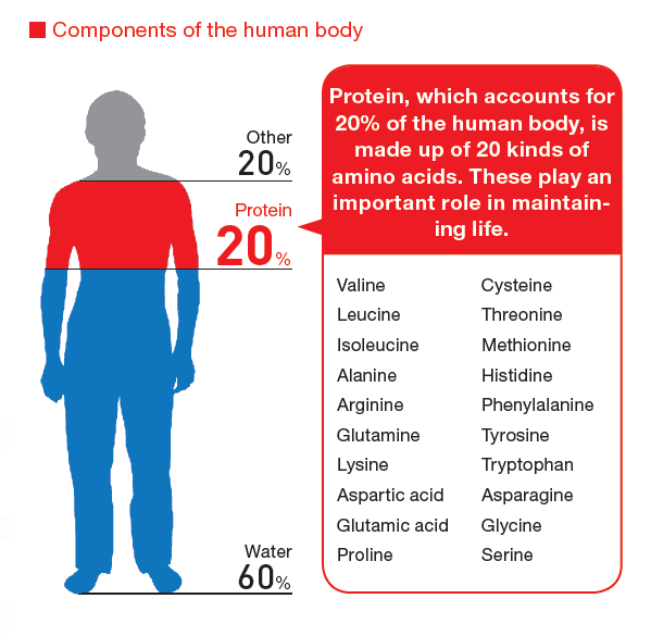
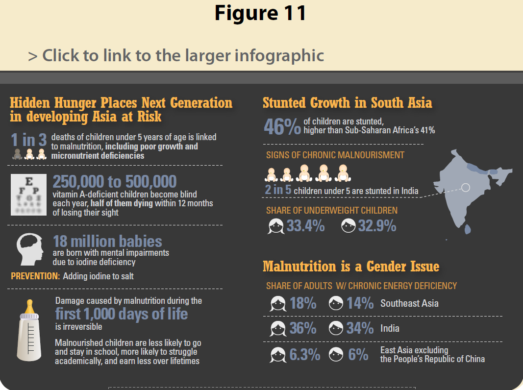
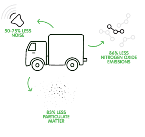
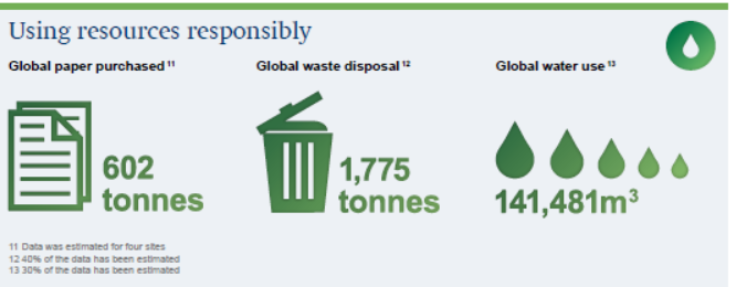
I sometimes think that infographics were invented in Japan. Maybe they were. It's hard to find a Japanese sustainability report that doesn't infographicize almost every topic on almost every page. Ajinomoto is one of my favorite Japanese companies and reporters. This 132 page report uses every possible infographic technique available, ranging from the simplest set of numbers to the most complex technical descriptions, and from the use of designed visuals to actual photos. Case studies are also presented in part-narrative, part-graphic part-photo format. It's an inforeportographic combo that is a microcosm of the total infographic content of almost all the other reports I have reviewed. On the whole, it's nicely done. The infographics by and large add value to the narrative and help create focus which, in a report crammed with information, breaks up the narrative and adds a little breather here and there. Most of the graphics are interesting, and cleverly done. I have selected only a few - there are looooooaaaaads more.


This is the only report I found that really uses real genuine exactly-what-you-mean-by infographics as an art form in this sustainability report. There are several really interesting and creative graphics presented in the report that you need to view in full online. The screenshots in the report are not very legible. Of the hundred and more reports I reviewed to prepare this post, this is the only one with a real infographic set, rather than inforeportographics that are prepared specially for reporting and are far less complex. Nice touch.  


I had to cover Asus because for years I have used only ASUS laptops for me and my team at Beyond Business. I just think they are the best. There's nothing nicer than getting a new ASUS. I love laptops. Oops, I digress. ASUS also designs a nice sustainability report with a few well chosen infographics. Not quite as heavilly laden as most Asian reports, but well-spaced and well-placed.


Couldn't do such a loooong post without any ice cream at all. Ben & Jerry's is one of the original CSR reporters, and their current reporting style is one long scroll-down, with a few links to extended stories. However, graphics play a part and even the title is a sort of inforeportographic. The performance graph is nicely creative, complete with bananas, cage-free eggs and chunks and swirls.


Not really much to learn from this report in terms of infographics aside from a few oilrigs, a terminal hub and lots of data points throughout the report accompanied by an icon in a circle.  But I was interested in learning a bit about Azerbaijan so I decided to take a look. 


Coca Cola always designs a great report, or designs great a report. Whatever. Fun, bold colors, bold graphics that well suit the brand and its message. Inforeportographics in this report make it more fun to read. They are used primarily to pull out the hot numbers in different sections, through there are a couple that are about processes, such as a nice colorful supply chain diagram. A small selection below from a larger collection in the full report.


Comcast's report is low-key infographically-speaking. Just two basic designs, with simple stat pull-outs. One has icons, and one has icons and photos. They are mainly separate from the narrative, on landing pages, so they don't really hit you between the eyes. The text-to-number ratio in the visual is more info than graphic, which sort of defeats the purpose. I didn't trouble myself to read the small print, so I was sort of left with a load of unconnected numbers in my head. Not sure I understood how all the icons connected to the numbers. A few examples here:


The Cooperative Group report is not one designed around infographics, through the narrative is supported by small pull-out boxes and captioned photos that illustrate the narrative and catch the eye. There are a couple of pull-out stats infographics at the start of the report, but where this report comes into its own is with two really creative infographics that show how the green store model works and how the distribution center model works. These are fun to explore. You have to read them at 200%, but it's a little compelling. The design makes you want to know what's going on in that green store, and how that distribution center really did earn its "excellent" BREEAM rating.


Delhaize's report is designed with a simple straightforward appeal and it's clear to read and understand. The design complements the overall tone of the report. Delhaize has icons for every part of the sustainability program and target subset. The use of infographics is equally simple and neatly done. Just a few, but just enough.


The summary download report from EMS is pretty much all narrative and pretty much no graphics and no color. With one exception. This inforeportographic. It covers the material issues and a selected fact per item. It may be good as a sort of cheat-sheet for people who work at EMC, but for me, it's somewhat hard to read and the flow doesn't really flow. The graphics don't really tell a clear story, and I had to enlarge to 250% to actually read the explanations on-screen. (OK, maybe it's time for a new pair of glasses).


Everest Textiles's report is a bit of a design pick'n'mix, with no clear theme for the design element, and therefore the small selection of infographics, mainly used to explain technical concepts are individual and not part of a coordinated design theme. As singles, however, each one tells the story it needs to tell, in its own way. 
 
Question: What do 51 little round purple blobs have to do with ISO 14001 certification? Answer: Ask the FedEx Citizenship Report designer. Haha. I am sure there's a sophisticated design thought in there somewhere, but it's out for lunch at the moment. FedEx doesn't go overboard on infographics, just on little round purple blobs. 


This legal firm's report is nicely done with quiet but effective use of infographics. The title page is a hyperlinked contents infographic, and the different chapters use big-block graphics to summarize key elements. In most of the infographics, the sub-text is large enough to read without squinting. Worth noting that all women have square shoulders at Freshfields, apparently. In my view, good use of visuals in this report, in the whole.


H&M is another reporter I have tracked over the years as part of my interest in the apparel sector. In general, I like what H&M has been doing in the garment industry and feel the company has made progress, despite the issues we can take up with fast fashion on a range of scores, yes, including Bangladesh. Reporting-wise, H&M has been getting more focused and I like the use of garment infograhics that tell you what's going on with the shirt you wear and the dress you take off the hanger. Aside from this, H&M uses the highlight pull-out big-number stats approach, and a couple of diagrams to explain key concepts. Nicely done, in my view. 


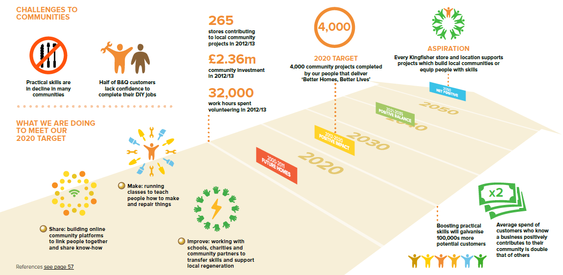
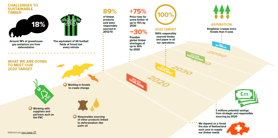
Kingfisher explains its net positive strategy and progress in a nicely visual way, with a main infographic that shows the path to Net Positive in each section. Same style and design, different themes, the graphics are attractive and make you want to read the fine print, of which, thankfully, there is not too much. Kingfisher even has an infographic footnote about infographics.


A great report with great inforeportographics. Thank you to colleague Derryn Heilbuth of BWD Australia, who worked with Lion to help create this report. This report uses infographicism to introduce main chapters and provide an overview of what's to come. The design blends with the report style and overall look and feel. In addition to the overview info's, clever use of design helps make sense of stat bundles. A little packed, they are nonetheless quite engaging graphics, making you want to pause and check them out.


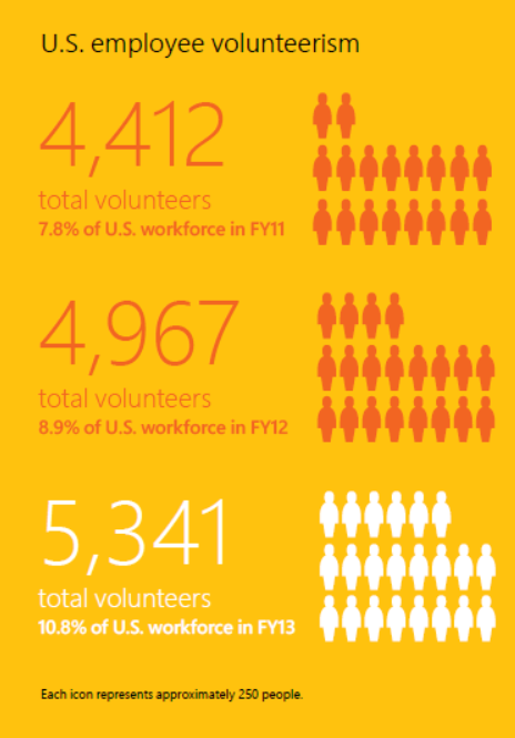
Microsoft hasn't gone overboard with inforeportographics, just a couple on energy and emissions, and one or two less complex representations. Terracotta army features here too in the form of lots of little lookalike volunteers.  


For a technology company, Mindtree's infographics all have a decidedly (surprisingly) spiritual feel. They are all circular and softly designed, subtly calming and smooth. Lots of icons in circles. Infographics here are used to explain concepts and processes, not numbers and statistics. 


Raffeisen Bank's use of inforeportographics is focused and clever. There are five main well-developed graphics, all following the same design line, which also aligns broadly with the design colors of the bank. In addition to a simple overview graphic, there are four invested visuals representing each of the four pillars of the bank's CSR approach and report chapters, showing key data and highlights from the year. Busy but not overly so, colorful but not overly so, infographics complement the report content effectively. I like this!


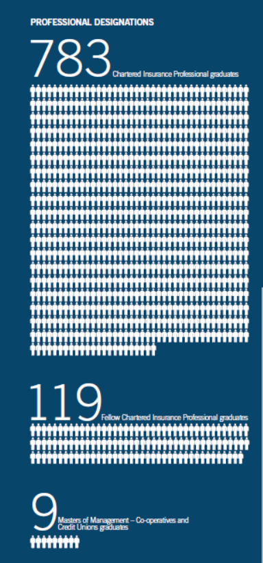
The 2013 Safeway report is a serious inforeportographic global league contender with a highly polished infographical approach. It opens up with a page of performance highlights, followed with a suite of smaller graphics for different purposes in the report. Some of them work well, some work less well. The icons are well-considered and a little more creative than the stock-icons that many reports just grab so they can stick something next to a number. On the other hand, infographics with line after line of little boy and girl figures, a bit like the Terracotta Army, to represent hundreds of thousands of employees, make me wonder if the designer has a penchant for ancient history. The infographics in this report work well within the overall report design, and help make the report appealing and accessible, just in case any Safeway customers might want to take an interest. I hope they do.


The Starbucks progress update report is fairly low-key design-wise and focused on a simple update of achievements against multi-year goals. Most of this 28-pager is narrative and a few photos, and there are just a couple of small process descriptor inforeportographics, each with circles and arrows. What gets this report on the infographic map, though, is the clever use of design in the progress update charts. Each chart has a little simple but clever visual twist that makes it just a little more attractive than a straightforward numbers bar-chart. I have included a few below but there are more that are worth checking out.


Not too much in the way of infographics in this report, but there are a few functional infographics that help us get past some of the technical aspects of the sustainability management and the mining industry.  I like the water inputs and outputs diagram, hidden inside a green mountain. This report is mainly green, as you may have noticed. 


Oh dear, it's the Terracotta Army again. Only one other infographic in this report. The rest is narrative.


That's all folks!
For now....


elaine cohen, CSR consultant, Sustainability Reporter, HR Professional, Ice Cream Addict. Author of Understanding G4: the Concise guide to Next Generation Sustainability Reporting  AND  Sustainability Reporting for SMEs: Competitive Advantage Through Transparency AND CSR for HR: A necessary partnership for advancing responsible business practices . Contact me via www.twitter.com/elainecohen   or via my business website www.b-yond.biz   (Beyond Business Ltd, an inspired CSR consulting and Sustainability Reporting firm
Related Posts with Thumbnails