At a time when everyone is focusing on standards, data and metrics, there’s another side to reporting that often gets overlooked: the graphic design of the report. While the content is the key, the design turns the key to make the content sing🎵. Inspired design makes content more accessible and appealing for those who actually want to read reports, rather than just mine the data. Beautiful reports are inspiring for employees as well attractive for all stakeholders.
It's clear that some report designs are constrained by in-house branding guidelines that prescribe fonts, colors, shapes and even layouts, so most report designs don't start with a blank page. Even so, there may be some design touches that help liven up the content. The key elements of great report design (in PDF), in my view, include:
- Pages that are pleasant to look at – not too empty, not too crowded, with a clear focus for the eye as it rests on the page. The thing that stands out should be the thing that’s most important, not just some random callout factoid.
- Consistent design language – I like the design to have its own language throughout the report, creating a familiarity and sense of expectation as you read through it. Disjointed, disconnected imagery and random font sizes and colors drive me a bit crazy.
- Clear tables and charts - legible and consistent across the report. Clear headings. NOT ALL CAPITALS. Block capital print is hard to read.
- Fonts – rightsized fonts, not too many either. Three different font sizes at most. They should be legible at 100% on my screen.
- Format – horizontal PDFs seem to work best for me. The wider sizes offer more room to play with on the page.
- Original photos – not image banks with plastic people and Amazon views. Real photos of a real business make the report more credible.
- Interesting design elements - little splashes of color or illustrations or (careful) icons, that complement and provide a pleasant eye-tonic alongside the text.
- Navigation navigation navigation. I want to sail through the PDF, back and forth, section to section, with single clicks. The navigation needs to be accessible, easy to follow, intuitive, interactive. Navigation tools are useful too. Love a home button that takes you to the contents page.
- Ice cream: The more images of ice cream, the better.
Things I hate in report design:
- Text that is not horizontal. I have ruined two computer screens when they fell off my desk as I tilted them to read vertical text. Haha.
- An abundance of meaningless icons
- Massive fonts
- Photos of palms holding globes
- Images representing diversity that are clearly misrepresentative of the organization
Not all reports that I consider beautiful adopt these design preferences. But they are all beautiful in one way or another because of the colors, visuals, tasteful imagery or other design creatives that bring the narrative to life in an attractive and inspiring way. To me, this shows a level of care and thought in the way the report is presented that helps me believe the intentions of the reporting company. I realize this may not always be a logical correlation, but, in their own way, beautiful reports are inspiring. Here are a few to feast your eyes on (while you are feasting the rest of you on your favorite ice cream):
Roma Group 2021/2022 ESG Report
Roma Group is a privately-owned small-business valuation and technical advisory services firm in Hong Kong, employing around 60 people. This is the Group’s fifth ESG Report, it’s In Accordance with GRI Core Option and complies with the Hong Kong Stock Exchange ESG reporting rules. At 49 pages, it’s compact, focused and a delight to view. In fact, all Roma Group reports are beautifully designed – take a look at them all.
Roma Group reports have a few signature design approaches for all reports that I like very much. First, the design links to the annual report theme - for example, this year's theme is "The Pursuit of Sustainability". The report creative uses a camping trip to illustrate this theme. This demonstrates that the designer is not just laying out any old content on a page, but thinking creatively about how to reinforce the report messaging.

A second design approach is a creative top menu bar. Although not interactive (a Home button linking back to the contents page would make navigation easier), each report chapter has a unique top menu illustration. A menu is not just a menu - it's an opportunity for creativity.

A third element is the design of headings. A heading is also an opportunity for creativity. In the examples below, you can see how the paragraph subheadings are embellished with design elements that provide visual interest, especially on text-heavy pages.


I award Roma Group my highest Ice Cream Accolade. Five cones. 🍦🍦🍦🍦🍦.
S Hotels & Resorts Sustainable Development Report 2021
S Hotels & Resorts is a Thailand-based operator with 38 properties in some of the most beautiful locations in the world. No surprise then that the imagery in this report reflects the beauty of the views that visitors can enjoy while consuming their Thai ice creams.

Aside from the spectacular images, the design of this report includes thoughtful ocean-related illustrations on every page and small icon-type illustrations for callouts and highlights. The style complements the narrative and turns each page into a work of art, rather than simply words and paragraphs. Data tables are neatly drawn. Here are a few pages:

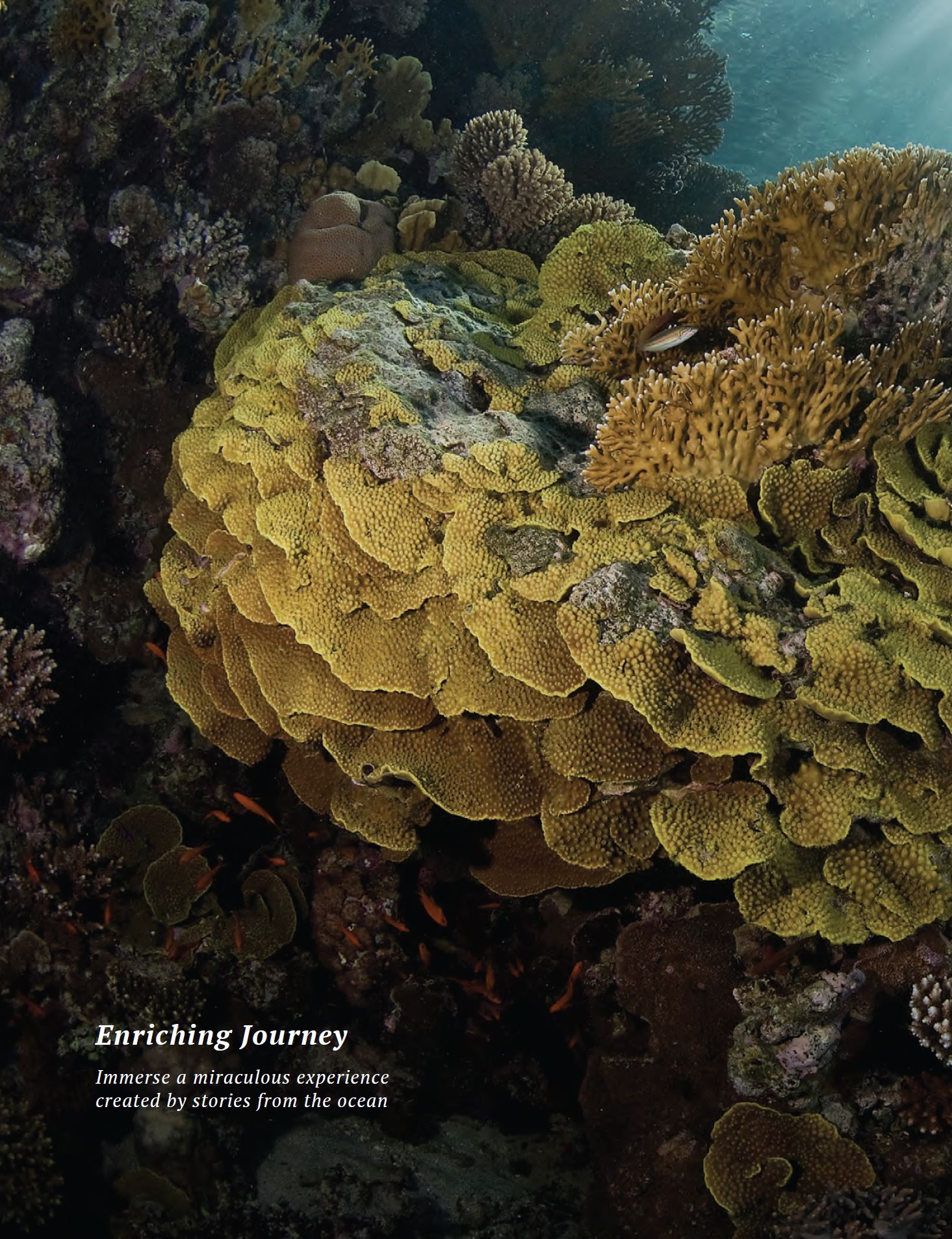


Definitely a four-cone design. 🍦🍦🍦🍦

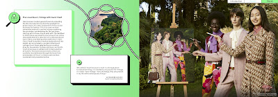
Gucci Equilibrium Impact Report 2021
Gucci is part of the global luxury group Kering that develops and markets fashion, leather
goods, jewellery and watches. This second annual Gucci Equilibrium Impact Report references the company's Environmental Profit and Loss accounting, a practice pioneered by Kering several years ago. The Gucci EP&L is not detailed in this report, but Kering's group EP&L is referenced.

The Gucci report combines vivid colors with light-touch design elements throughout the report. Using thread-like elements on each page to liven up images and creative icons for bullets, the report is super attractive in an understated sort of way. A compact navigation top menu on each page helps you get around this 42-page report. In fact, the report is a horizontal wide-page design that fills the screen from end-to-end, where each page actually holds the content of two regular pages, like double spreads. This adds a nice flow to the content and enables continuity on certain pages, such as the timeline page. Oh, and if you are looking for page numbers, don't bother. There are none in this report. Can't decide if that's a good thing or not - certainly one less thing to crowd the page, but perhaps less functional. Don't forget to stock up on luxury ice cream to view this sample of pages from the Gucci report.


Four cones to Gucci 🍦🍦🍦🍦.
Genesys 2021 Sustainability Report
California-headquartered cloud-based software and artificial intelligence (AI) technology company Genesys has created a beautiful report out of a lot of white space and a focused color palette.

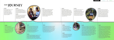
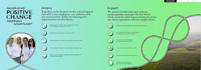
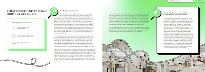
Using bold colors, brush-stroke design elements and a handwritten-style callout font, it all hangs together in a truly appealing way. Bold images for the section landing pages are captivating, and little touches such as the illustrations on the inclusion timeline chart add visual interest. A full navigation top menu makes navigation super easy. This report is quite masterful in projecting a clean, uncluttered design approach while incorporating a range of content, images, tables, charts and graphs.


Metaxa Hospitality Group Sustainability Report 2021
The Metaxa Group is a Greek-based group operating on the beautiful islands of Crete and Santorini. The Metaxa report projects a Mediterranean calm, inviting you to relax by the deep blue waters of the a hotel pool (don't forget the ice cream) as you peruse its pages.

The beauty in this report is in the flowing lines of the pages, the awe-inspiring imagery of the local landscapes, the colors that remind you of a sandy beach and the careful page composition that, on several pages, includes photos, callouts, data and text. Although sometimes it's quite a lot, it's tastefully put together and maintains a peaceful, calm design feel throughout. Some images are used as page backgrounds, but care is taken not to render any text illegible. The top menu is not interactive, which is a pity, but it helps you know where you are in the report.


**************
That completes today's roundup of beautiful reports. There are many other fabulous report designs out there - so many different styles and formats - many more that are very impressive. And of course, no matter how beautiful the report, it's the content that we are all looking for. But, at least, just in case you were wondering, now you know that there is also beauty in reporting.


No comments:
Post a Comment