Showing posts with label h&m. Show all posts

Saturday, September 27, 2014

The G4 technobabble of Aspect Boundaries

One of the things that appears challenging for many reporters in G4 requirements to define material Aspect Boundaries. I just had a query on that this week from another consultant who is working an a client G4 report.  Here are the GRI disclosure requirements:

When you get past the techno-babble, you can see that reporters are asked to state the locations where material impacts occur. It's fairly easy to assume what was in the minds of the GRI G4 designers when they put this together. It's like this. Not all impacts are equal, and not all impacts are relevant to all parts of an organization. Some have an impact outside the organization, and, taking a value chain approach to sustainability, it's important to identify where your organization is accountable even though it is not directly in control. The GRI FAQ states: "Listing entities outside of the organization where impacts related to material Aspects occur, is the first step for reporters to show that they are aware of these impacts in their value chain."

One of a few examples in the G4 implementation manual refers, for example, to child labor in the supply chain. 


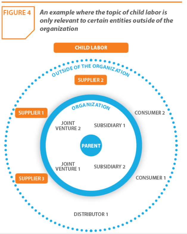
While child labor may be strictly controlled in direct company operations, it's much harder to control in the supply chain and the relevant material impact may be pinpointed there. The G4 expectation, therefore, is that companies would specifically identify impacts that occur outside the organization as well as inside, making a distinction between the two, so that stakeholders can be appropriately informed. 

At some level, this makes sense. It's part of the G4 transformation that requires companies to actually think about their material issues rather than auto-list boilerplate issues that mean everything to everybody. Now, reporters should think about who is affected outside the factory gate as well. Companies which analyze their material issues right down to specific localized impacts will probably have a better foundation for addressing the risks of  such issues and engaging more closely with local stakeholders to inform a strategic approach.  

However, this is proving to be rather challenging for many large reporters at a global level. Responses to G4-20 and G4-21 are lacking depth and showing signs of box-ticking in a way that undermines the true value of this kind of disclosure. Remember that the Aspect Boundary relates to a material Aspect, and each material Aspect requires a DMA - a disclosure on management approach describing why the Aspect is material and what the organization is doing about it. G4-20 and G4-21 are effectively extensions of the descriptions of the most material issues.

Material issues are not that simple, however. Almost every material issue that has an external impact also has an internal one and vice versa. Companies are having a hard time understanding the distinction between the two. The default seems to be that everything impacts everything and everybody and all company entities are affected. In G4-21, there is also a requirement to state the geographical location where external impacts occur. Well. GRI might just have suggested an auto-response for this. The Universe. 

Insurance company Metlife's G4 2013 Corporate Responsibility report was just published. Take a look Metlife's response to G4-201 and G4-21 to a some of their material issues. 


As you can see, everything is both material internally and externally and impacting pretty much everyone everywhere. Stakeholder groups (not entities) have been noted against each issue. Entities have not been stated so we can assume everything applies to the entire organization. 

It's not so easy to define where impacts occur. Employment and diversity are noted as only material internally. However, in some cases, with large companies, the impact of a diverse employment policy can be quite significant in local communities.  Many of the decisions taken in the Human Resources Department have broadly-felt impacts on society. Check out my book, CSR for HR. The stakeholder view of people management goes way beyond the impacts felt inside the organization. Metlife confirms this in the DMA for this diversity:

The impact of a diverse organization is also felt at the level of customers and in communities. With operations around the world, and more than 65,000 employees, perhaps Metlife's hiring and inclusion policies are having an impact at local level. Or maybe not materially so. It's an interesting thought - one that is probably answered through engagement with local stakeholders.  

What about public policy? Metlife calls this  both an internal and an external impact. I can understand the external part. In the DMA, Metlife writes:


This seems to indicate that the impact is external, rather than internal. So where is the internal impact? Could it be that engaging in public policy requires an internal effort  by the organization to understand and maintain positions on public policy, ensure staff are appropriately trained, manage the internal adjustments required as a result of regulatory changes etc? Could it be the effect on profit of political donations? It's possible. But Metlife has not mentioned this internal impact in its narrative, focusing on the external impacts of regulation. The performance indicator supporting this material issue that Metlife reports is G4-S06 which relates to the number of political donations made -  maybe this is then both internal (expenditure/profit) and external (political influence). Either way, deciding the exact Aspect Boundary of this material Aspect is not so straightforward. 

Metlife is not the only one....

Banco Santander in its G4 Comprehensive report for 2013  report adds a nice little matrix (it's in Portuguese but we'll get the gist).

Everything is material internally and externally (red triangles) , with the exception of the positive impacts of the bank on society (black circle) - indirect economic impacts and local community impacts. These are not considered to have an internal impact. In addition, in the report's GRI Content Index, Banco Santander notes different stakeholder groups that are affected by the different impacts. But no differentiation is made between entities and no geographic location is mentioned. Oh, and this report was verified by Deloitte. 

Dow Chemicals in its G4 comprehensive 2013 Annual Sustainability Report also has a nice little matrix. Dow is a global company with 53,000 people and products manufactured in 201 sites in 63 countries. Try breaking down Aspect Boundaries for each of those entities.


At Dow, then, all material impacts are internally material. Only three material impacts are external as well, affecting broader society - product safety, health and environment protection and community success. Issues such as water, sustainable agriculture and climate change are not noted as materially important outside the organization. I wonder how this analysis was performed and how material issues such as climate change and sustainable agriculture are not considered to be  material externally. Oh, and this report was verified by ERM. 


H&M Conscious Actions 2013 Sustainability Report fares no better on G4-20 and G4-21. The response to these disclosures is a webpage. But the webpage is the GRI index page. So you get into a G4-20 G4-21 loop -  and you never get to the actual disclosure. That's one way of avoiding having to think about this rather messy disclosure conundrum. 


Oh, and the H&M report was verified by Ernst and Young.

CVS Caremark's 2013 CSR Report includes a little more detail in this table contained in the content index. It clearly states that internal issues relate to all CVS Caremark's operations in the U.S. and that externally material issues are predominantly in the supply chain in China. This is getting closer to the G4-20 and G4-21 requirement.


But, with 19 material issues, this summary goes only part way to fully providing the Aspect Boundaries for each material Aspect. Also, in all the external issues reported, the company is noted as one of the affected stakeholders. But the company is an internal stakeholder. Hmm. A bit confusing. 

GRI's own G4 report has a fairly clear approach. Although geographic locations are not noted, there are some explanations as to what's material to whom. Most of the material impacts occur both externally and internally.  


Overall, then, I am not finding responses to G4 Aspect Boundaries especially helpful in many of the G4 reports I have reviewed so far.  I think this just as much a flaw of the framework as it is with reporters who can't be bothered to think about this more meaningfully or simply don't know how to respond.

The idea is good. 
Companies should identify how and where their operations are impacting external stakeholders. 
It's quite simple really.
But, the roundabout rather convoluted GRI-techno-babble of G4-20 and G4-21 dumbfounds companies and is leading to a bunch of stilted and meaningless disclosures. It's also dumbfounding report assurers - all of whom confirm that reports are in accordance when these basic general disclosures are not adequately reported. 

In G5, maybe it would be simpler to have just one disclosure. Forget internal impacts. Everything the company externally does affects it internally one way or another. There's not much point in stating that everything affects employees. 

My suggestion:

G5-20: State how and where your business activities materially affect external stakeholders throughout your value chain. 

Voila! Plain, simple, clear, helpful and tecnhobabbly-challenged.

No?

elaine cohen, CSR consultant, Sustainability Reporter, HR Professional, Ice Cream Addict. Author of Understanding G4: the Concise guide to Next Generation Sustainability Reporting  AND  Sustainability Reporting for SMEs: Competitive Advantage Through Transparency AND CSR for HR: A necessary partnership for advancing responsible business practices . Contact me via www.twitter.com/elainecohen   or via my business website www.b-yond.biz   (Beyond Business Ltd, an inspired CSR consulting and Sustainability Reporting firm). Check out our G4 Report Expert Analysis Service - for published G4 reports or pre-publication - write to Elaine at info@b-yond.biz  to help make your G4 reporting  even better.   

Tuesday, July 15, 2014

120 Sustainability Report infographics

Trending: infographics in sustainability reports. As our collective attention spans contract to the point where a quick glance at anything competes with the multitude of quick glances that determine the way we process content today, sustainability reports are catching up. Not yet quite at the level of being written in tweets and hashtags, any self-respecting sustainability report in the current visual age must nonetheless convert messages into pictures, numbers into equivalents, good and bad into ticks and crosses, ideas into light-bulbs, communities into talking heads, environment into leaves and globes and "more info" into magnifying glasses. Icons, arrows, bullets, spotlights, avatars, logos and all things digitally visual are good game in the new era of sustainability inforeportographics. 

What is an infographic? I found this neat description on Visual.ly:

"They're data visualizations that present complex information quickly and clearly. Think of maps, signs, and charts used by statisticians or computer scientists: Wherever you have deep data presented in visual shorthand, you've got an infographic. Infographics are important because they change the way people find and experience stories -- especially now, when more and more infographics are being used to augment editorial content on the web. Infographics create a new way of seeing the world of data, and they help communicate complex ideas in a clear and beautiful way."

By the way, you can find a great sustainability concepts infographic page on Pinterest, curated by the brilliant Julie Urlaub of Taiga Company. Some are really really really nice.

However, as with reports themselves, there are good inforeportographics and there are bad inforeportographics. What makes an infographic better than the rest? I haven't found a conclusive answer to that one, but I did find the best 83 infographics on the web, published by Creative Bloq last year. There you can find infographics about everything imaginable, including the Apple Tree, depicting Apple products through the ages, Twitter psychology, an interactive infographic to calculate the distance to Mars, Superman costume changes over time (one for my 12 year old son, a Superman wannabe), the current state of social networks (this time for my 16 year old daughter who even dreams in Whatsapp)  and even a sustainability related infographic about the growth of green technology from the World Bank. After reviewing all of these infographics, I am now an expert haha!  The things that I look for in an inforeportographic are:

  • I get it - it's quick and easy to understand
  • I love the colors
  • It's really creative
  • It's compact
  • I don't have to squint to read it
  • It complements the report narrative well

There are a few distinct types of infographics that we can find in sustainability report. First, the most popular, are the ones that summarize performance highlights across a range of metrics, hoping that adding a few icons to the numbers will make the numbers more palatable. Then there are those infographics that turn simple graphs into works of art - so fifty thousand people becomes lots of little talking heads all across the page, or $50,000 becomes loads of little money bags. Other popular graphics are used to show the supply chain, or the value chain, in a cool way. Then there are infographics that tell stories, supporting case studies in reports, or trying to. Finally, there are infographics that do nothing more than add color to a page or highlight a number or two in big and bright colors.

Here's a collection of 120 infographics of all shapes and sizes from 23 reports of all shapes and sizes. If it doesn't add up to 120, blame Blogger. I also looked at more than one hundred other reports in order to make this selection, and could have looked at hundreds more. So if I have missed any really really really great designs, well, sorry.


I sometimes think that infographics were invented in Japan. Maybe they were. It's hard to find a Japanese sustainability report that doesn't infographicize almost every topic on almost every page. Ajinomoto is one of my favorite Japanese companies and reporters. This 132 page report uses every possible infographic technique available, ranging from the simplest set of numbers to the most complex technical descriptions, and from the use of designed visuals to actual photos. Case studies are also presented in part-narrative, part-graphic part-photo format. It's an inforeportographic combo that is a microcosm of the total infographic content of almost all the other reports I have reviewed. On the whole, it's nicely done. The infographics by and large add value to the narrative and help create focus which, in a report crammed with information, breaks up the narrative and adds a little breather here and there. Most of the graphics are interesting, and cleverly done. I have selected only a few - there are looooooaaaaads more.


This is the only report I found that really uses real genuine exactly-what-you-mean-by infographics as an art form in this sustainability report. There are several really interesting and creative graphics presented in the report that you need to view in full online. The screenshots in the report are not very legible. Of the hundred and more reports I reviewed to prepare this post, this is the only one with a real infographic set, rather than inforeportographics that are prepared specially for reporting and are far less complex. Nice touch.  


I had to cover Asus because for years I have used only ASUS laptops for me and my team at Beyond Business. I just think they are the best. There's nothing nicer than getting a new ASUS. I love laptops. Oops, I digress. ASUS also designs a nice sustainability report with a few well chosen infographics. Not quite as heavilly laden as most Asian reports, but well-spaced and well-placed.


Couldn't do such a loooong post without any ice cream at all. Ben & Jerry's is one of the original CSR reporters, and their current reporting style is one long scroll-down, with a few links to extended stories. However, graphics play a part and even the title is a sort of inforeportographic. The performance graph is nicely creative, complete with bananas, cage-free eggs and chunks and swirls.


Not really much to learn from this report in terms of infographics aside from a few oilrigs, a terminal hub and lots of data points throughout the report accompanied by an icon in a circle.  But I was interested in learning a bit about Azerbaijan so I decided to take a look. 


Coca Cola always designs a great report, or designs great a report. Whatever. Fun, bold colors, bold graphics that well suit the brand and its message. Inforeportographics in this report make it more fun to read. They are used primarily to pull out the hot numbers in different sections, through there are a couple that are about processes, such as a nice colorful supply chain diagram. A small selection below from a larger collection in the full report.


Comcast's report is low-key infographically-speaking. Just two basic designs, with simple stat pull-outs. One has icons, and one has icons and photos. They are mainly separate from the narrative, on landing pages, so they don't really hit you between the eyes. The text-to-number ratio in the visual is more info than graphic, which sort of defeats the purpose. I didn't trouble myself to read the small print, so I was sort of left with a load of unconnected numbers in my head. Not sure I understood how all the icons connected to the numbers. A few examples here:


The Cooperative Group report is not one designed around infographics, through the narrative is supported by small pull-out boxes and captioned photos that illustrate the narrative and catch the eye. There are a couple of pull-out stats infographics at the start of the report, but where this report comes into its own is with two really creative infographics that show how the green store model works and how the distribution center model works. These are fun to explore. You have to read them at 200%, but it's a little compelling. The design makes you want to know what's going on in that green store, and how that distribution center really did earn its "excellent" BREEAM rating.


Delhaize's report is designed with a simple straightforward appeal and it's clear to read and understand. The design complements the overall tone of the report. Delhaize has icons for every part of the sustainability program and target subset. The use of infographics is equally simple and neatly done. Just a few, but just enough.


The summary download report from EMS is pretty much all narrative and pretty much no graphics and no color. With one exception. This inforeportographic. It covers the material issues and a selected fact per item. It may be good as a sort of cheat-sheet for people who work at EMC, but for me, it's somewhat hard to read and the flow doesn't really flow. The graphics don't really tell a clear story, and I had to enlarge to 250% to actually read the explanations on-screen. (OK, maybe it's time for a new pair of glasses).


Everest Textiles's report is a bit of a design pick'n'mix, with no clear theme for the design element, and therefore the small selection of infographics, mainly used to explain technical concepts are individual and not part of a coordinated design theme. As singles, however, each one tells the story it needs to tell, in its own way. 
 
Question: What do 51 little round purple blobs have to do with ISO 14001 certification? Answer: Ask the FedEx Citizenship Report designer. Haha. I am sure there's a sophisticated design thought in there somewhere, but it's out for lunch at the moment. FedEx doesn't go overboard on infographics, just on little round purple blobs. 


This legal firm's report is nicely done with quiet but effective use of infographics. The title page is a hyperlinked contents infographic, and the different chapters use big-block graphics to summarize key elements. In most of the infographics, the sub-text is large enough to read without squinting. Worth noting that all women have square shoulders at Freshfields, apparently. In my view, good use of visuals in this report, in the whole.


H&M is another reporter I have tracked over the years as part of my interest in the apparel sector. In general, I like what H&M has been doing in the garment industry and feel the company has made progress, despite the issues we can take up with fast fashion on a range of scores, yes, including Bangladesh. Reporting-wise, H&M has been getting more focused and I like the use of garment infograhics that tell you what's going on with the shirt you wear and the dress you take off the hanger. Aside from this, H&M uses the highlight pull-out big-number stats approach, and a couple of diagrams to explain key concepts. Nicely done, in my view. 


Kingfisher explains its net positive strategy and progress in a nicely visual way, with a main infographic that shows the path to Net Positive in each section. Same style and design, different themes, the graphics are attractive and make you want to read the fine print, of which, thankfully, there is not too much. Kingfisher even has an infographic footnote about infographics.


A great report with great inforeportographics. Thank you to colleague Derryn Heilbuth of BWD Australia, who worked with Lion to help create this report. This report uses infographicism to introduce main chapters and provide an overview of what's to come. The design blends with the report style and overall look and feel. In addition to the overview info's, clever use of design helps make sense of stat bundles. A little packed, they are nonetheless quite engaging graphics, making you want to pause and check them out.


Microsoft hasn't gone overboard with inforeportographics, just a couple on energy and emissions, and one or two less complex representations. Terracotta army features here too in the form of lots of little lookalike volunteers.  


For a technology company, Mindtree's infographics all have a decidedly (surprisingly) spiritual feel. They are all circular and softly designed, subtly calming and smooth. Lots of icons in circles. Infographics here are used to explain concepts and processes, not numbers and statistics. 


Raffeisen Bank's use of inforeportographics is focused and clever. There are five main well-developed graphics, all following the same design line, which also aligns broadly with the design colors of the bank. In addition to a simple overview graphic, there are four invested visuals representing each of the four pillars of the bank's CSR approach and report chapters, showing key data and highlights from the year. Busy but not overly so, colorful but not overly so, infographics complement the report content effectively. I like this!


The 2013 Safeway report is a serious inforeportographic global league contender with a highly polished infographical approach. It opens up with a page of performance highlights, followed with a suite of smaller graphics for different purposes in the report. Some of them work well, some work less well. The icons are well-considered and a little more creative than the stock-icons that many reports just grab so they can stick something next to a number. On the other hand, infographics with line after line of little boy and girl figures, a bit like the Terracotta Army, to represent hundreds of thousands of employees, make me wonder if the designer has a penchant for ancient history. The infographics in this report work well within the overall report design, and help make the report appealing and accessible, just in case any Safeway customers might want to take an interest. I hope they do.


The Starbucks progress update report is fairly low-key design-wise and focused on a simple update of achievements against multi-year goals. Most of this 28-pager is narrative and a few photos, and there are just a couple of small process descriptor inforeportographics, each with circles and arrows. What gets this report on the infographic map, though, is the clever use of design in the progress update charts. Each chart has a little simple but clever visual twist that makes it just a little more attractive than a straightforward numbers bar-chart. I have included a few below but there are more that are worth checking out.


Not too much in the way of infographics in this report, but there are a few functional infographics that help us get past some of the technical aspects of the sustainability management and the mining industry.  I like the water inputs and outputs diagram, hidden inside a green mountain. This report is mainly green, as you may have noticed. 


Oh dear, it's the Terracotta Army again. Only one other infographic in this report. The rest is narrative.


That's all folks!
For now....


elaine cohen, CSR consultant, Sustainability Reporter, HR Professional, Ice Cream Addict. Author of Understanding G4: the Concise guide to Next Generation Sustainability Reporting  AND  Sustainability Reporting for SMEs: Competitive Advantage Through Transparency AND CSR for HR: A necessary partnership for advancing responsible business practices . Contact me via www.twitter.com/elainecohen   or via my business website www.b-yond.biz   (Beyond Business Ltd, an inspired CSR consulting and Sustainability Reporting firm
Related Posts with Thumbnails